Built for peoplewith questions.
Brand collateral,
Collateral for Casino Mining Corporation
Created as Art Director while at BOLD LIP.
The ask
The brand’s built! Now it has to show up everywhere.
The Casino Project is a mining project in the Yukon. BOLD LIP had already led the brand refresh, and it was a great one. My job was anything that came after.
That meant:
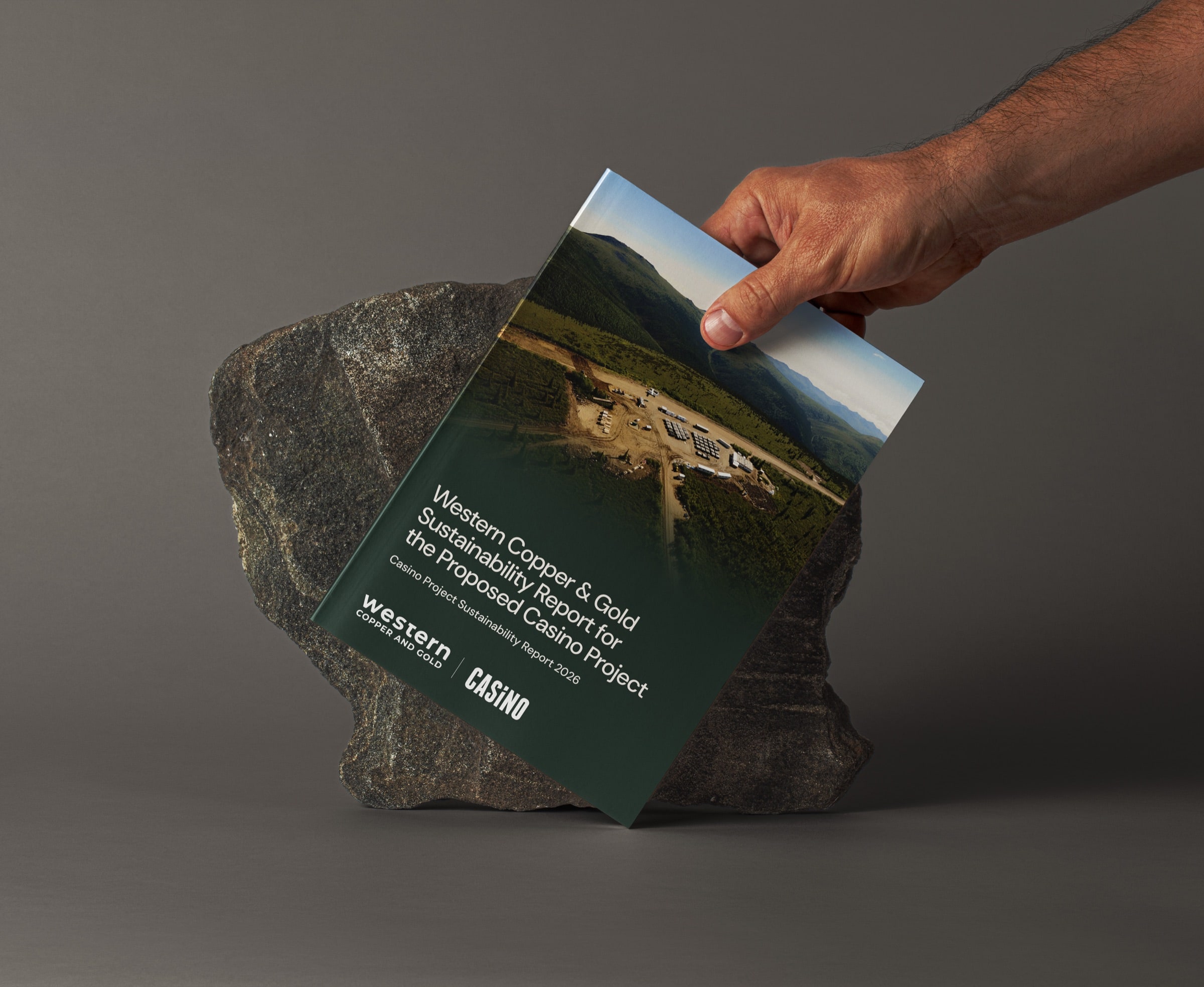
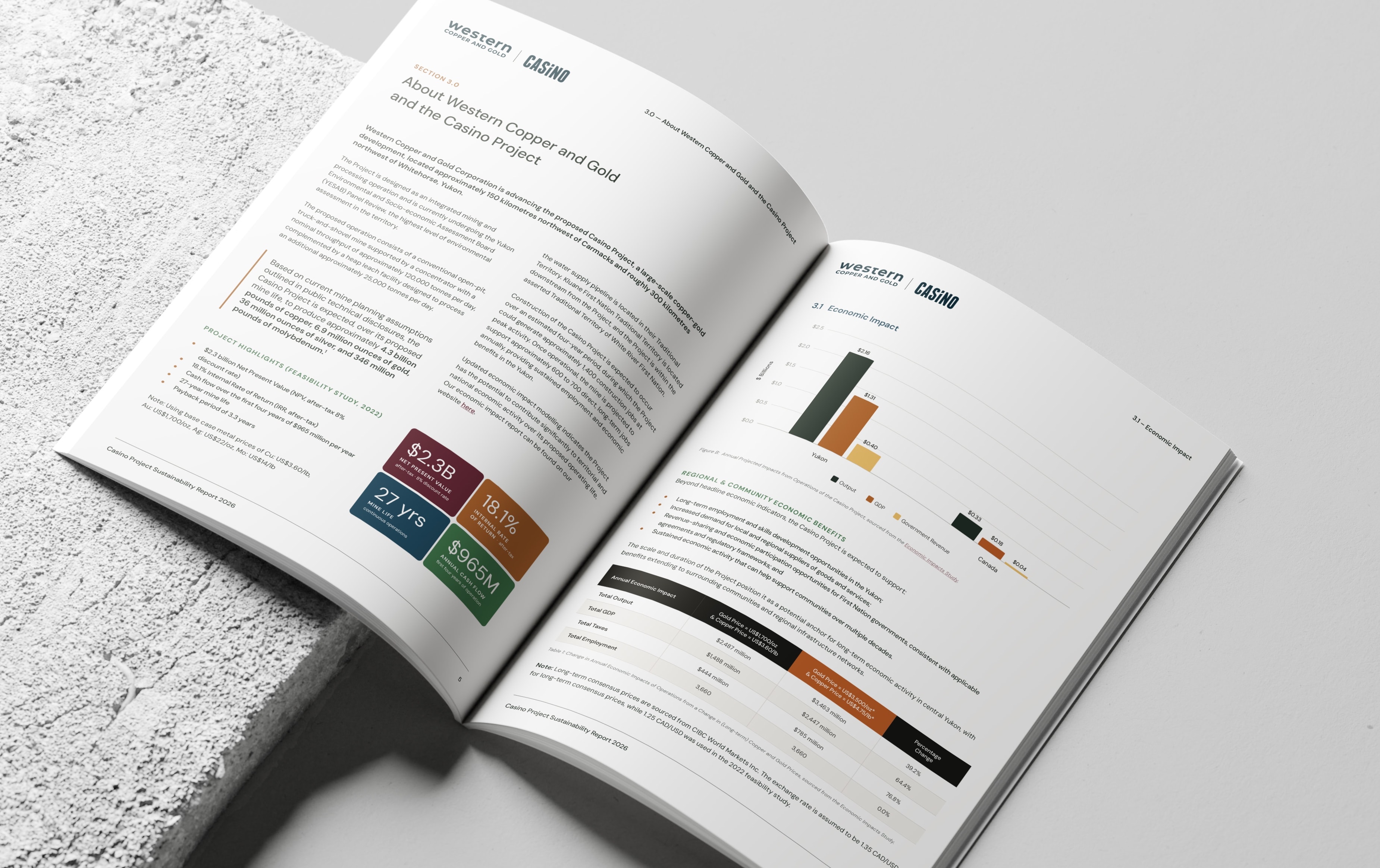
- Reports
- Ads
- Posters
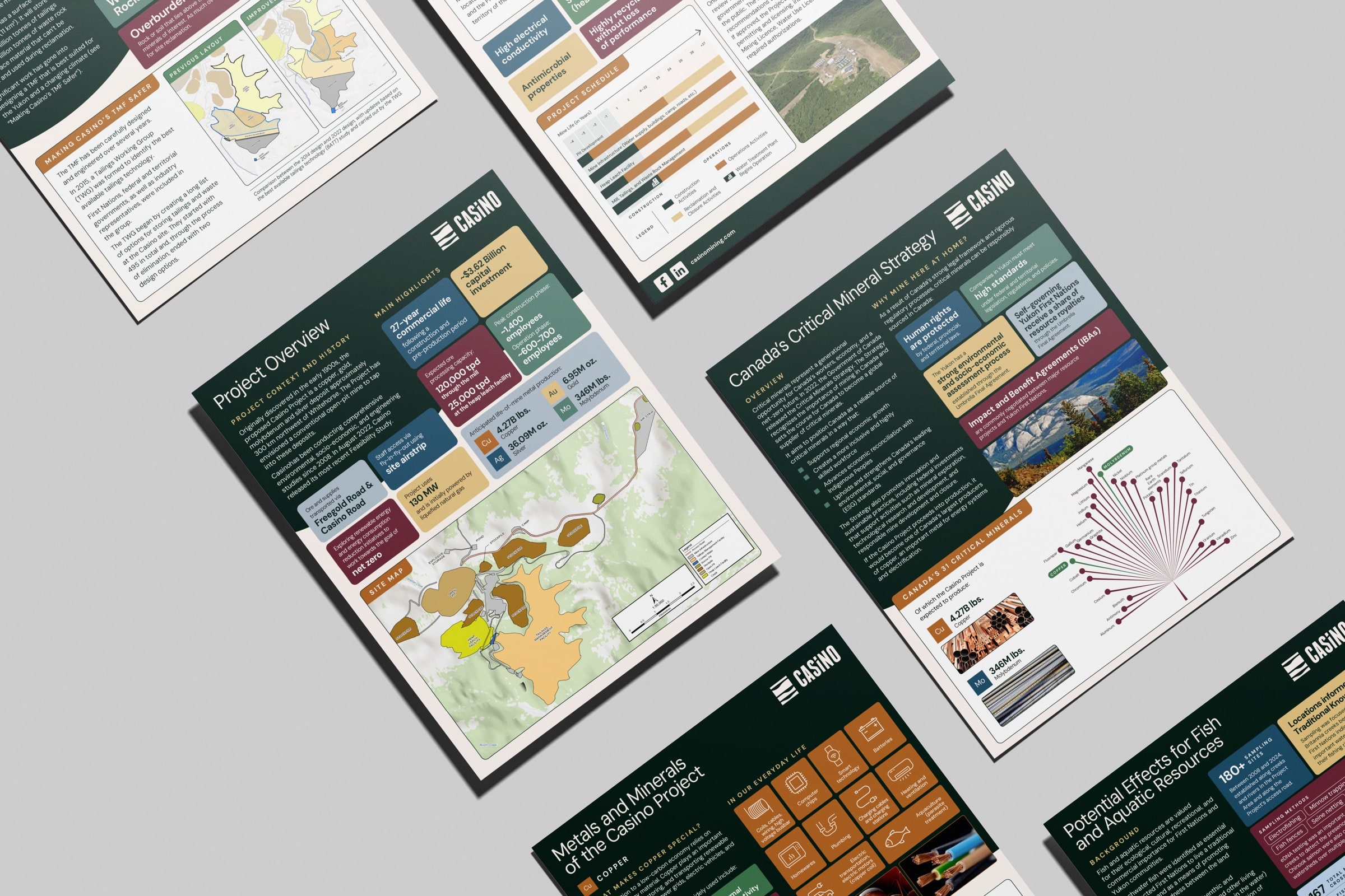
- Handouts
- Social posts
- An activity book (for kids)
- Signage
- A mural
- A calendar
- Newsletters
- …and whatever came in next
Production work, technically. Except the people reading it weren’t doing so for fun.
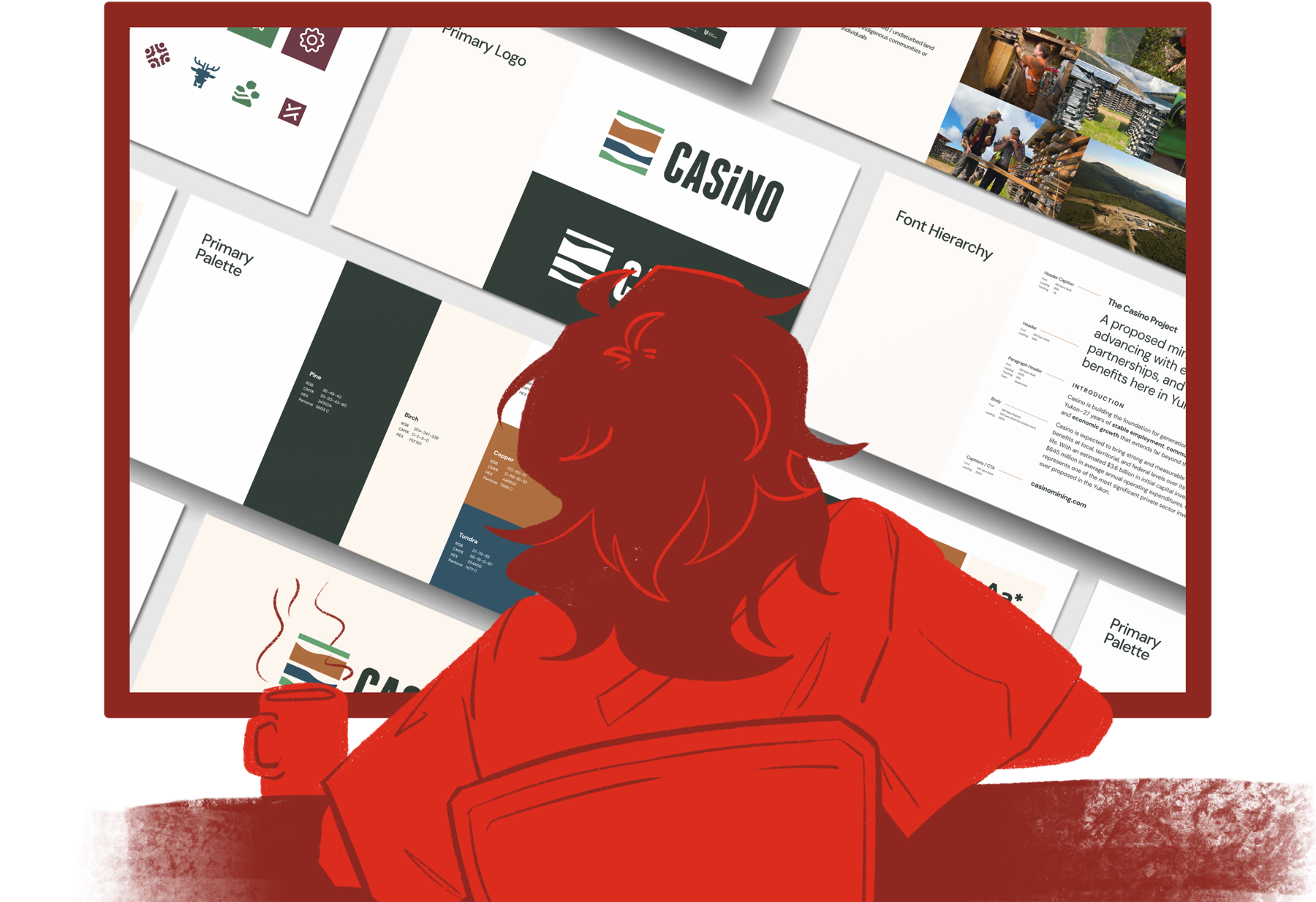
(Me, meeting the new Casino brand.)
The guiding light
Mining doesn’t get the benefit of the doubt.
Mining isn’t exactly famous for its ethics. Nor is it known for being particularly easy to understand.
Remember, this is a public-facing project in the Yukon. The people reading it, largely First Nation communities, have every reason to be skeptical and every right to understand.
The way I see it, those two things aren’t really in conflict. Skeptical people, especially in this context, don’t need persuading. They need information they can actually use.
TL;DR: Not “make mining look good” but “make it clear.”
The catch
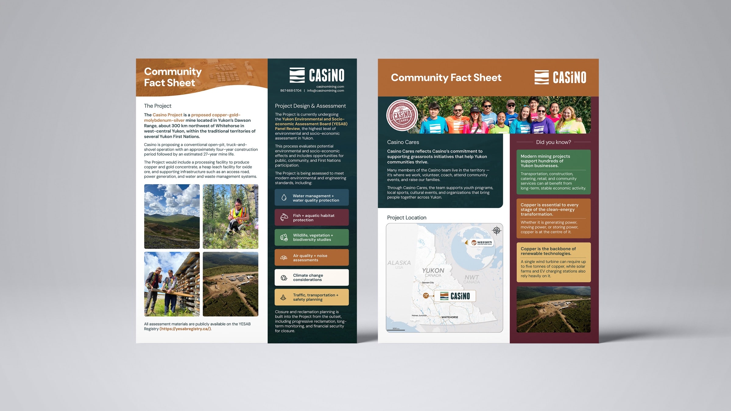
Lots to say. I mean LOTS.
Safety, environmental commitments, and community benefits can’t be cut for space. Neither can the numbers, the maps, the timelines, or the regulatory context. So white space, the designer’s beloved, was mostly off the table.
The pages were going to be full. I had to make full feel digestible.
Side quests!
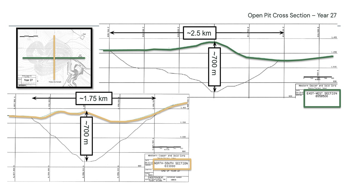
Most of the work was full layouts: reports, ads, posters, the whole composed thing. But every so often, smaller assets showed up and quietly tested me. Like this graphic. The challenge? Turning this diagram only an engineer could love into one a neighbour could read.
Original
The task description said this was an open pit mine. I would have guessed a seismograph, or possibly a mountain?
In all seriousness, it’s a cross-section graphic, accurate and complete, and built for people who already know how to read one. My first thought was how to get a non-engineer to understand without doing too many mental gymnastics.
Rebuilt
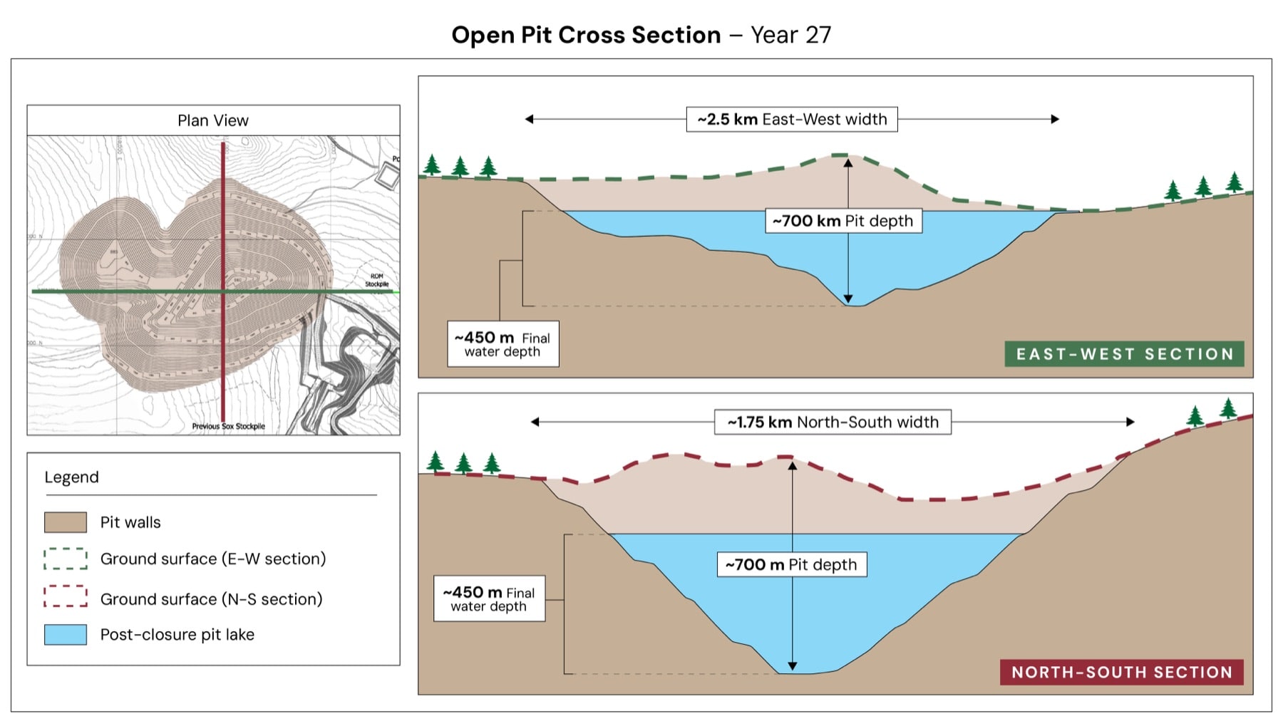
Simplifying it ended up meaning redrawing it. A plan view shows where the cuts were taken, and each section’s colour matches its line on the map, so nobody has to cross-reference anything. The post-closure pit lake gets its own colour, since it’s the end state and what most readers want to know about.
Is it art? No. But it’s an asset meant to be dropped into decks, reports, and whatever else needs it, and there, clear beats pretty as much as it pains me to say it.
Bonus! The activity book
The toughest audience: Kids.
Adults will push through a dense report because they have to. Kids sure won’t.
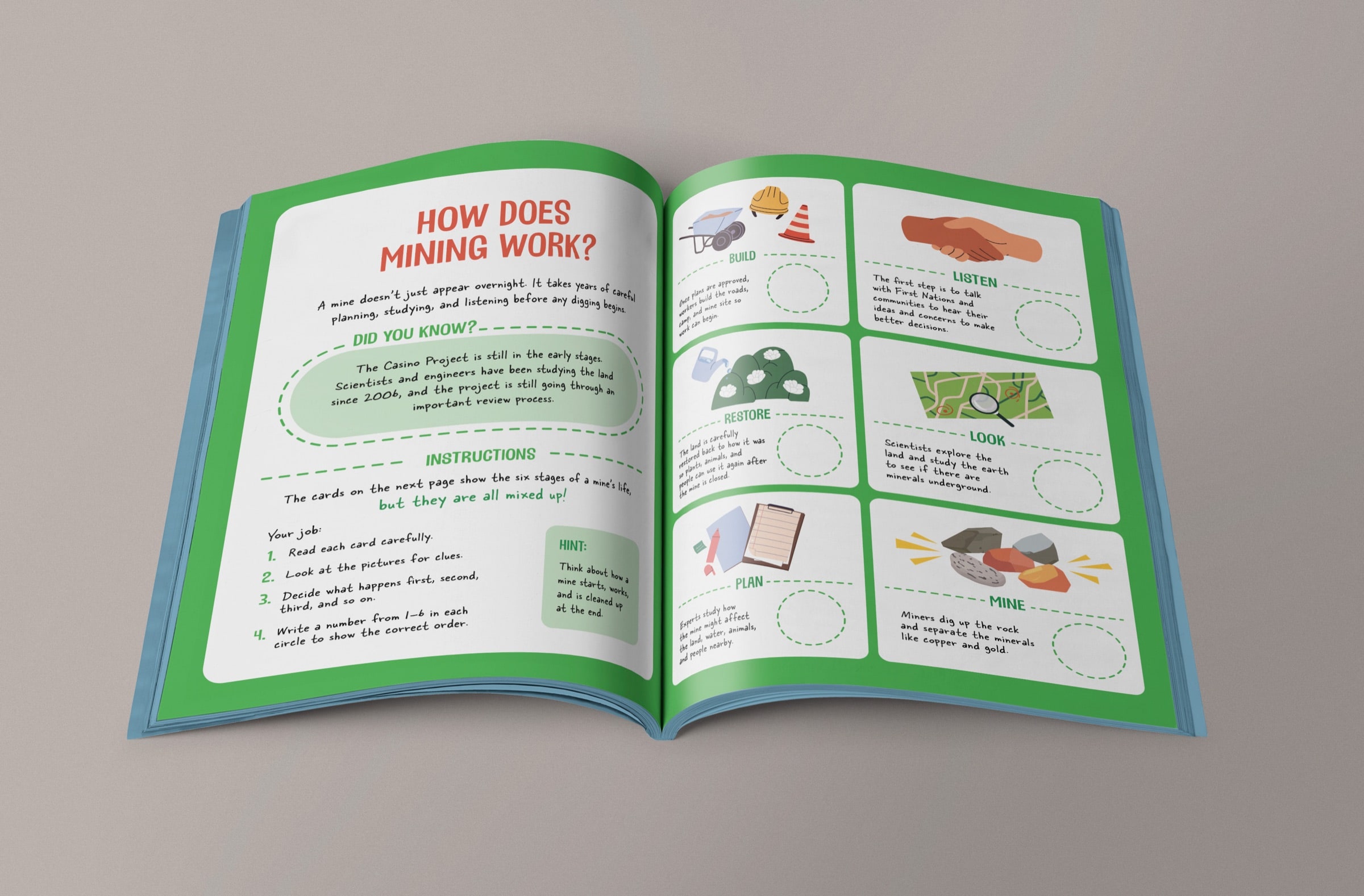
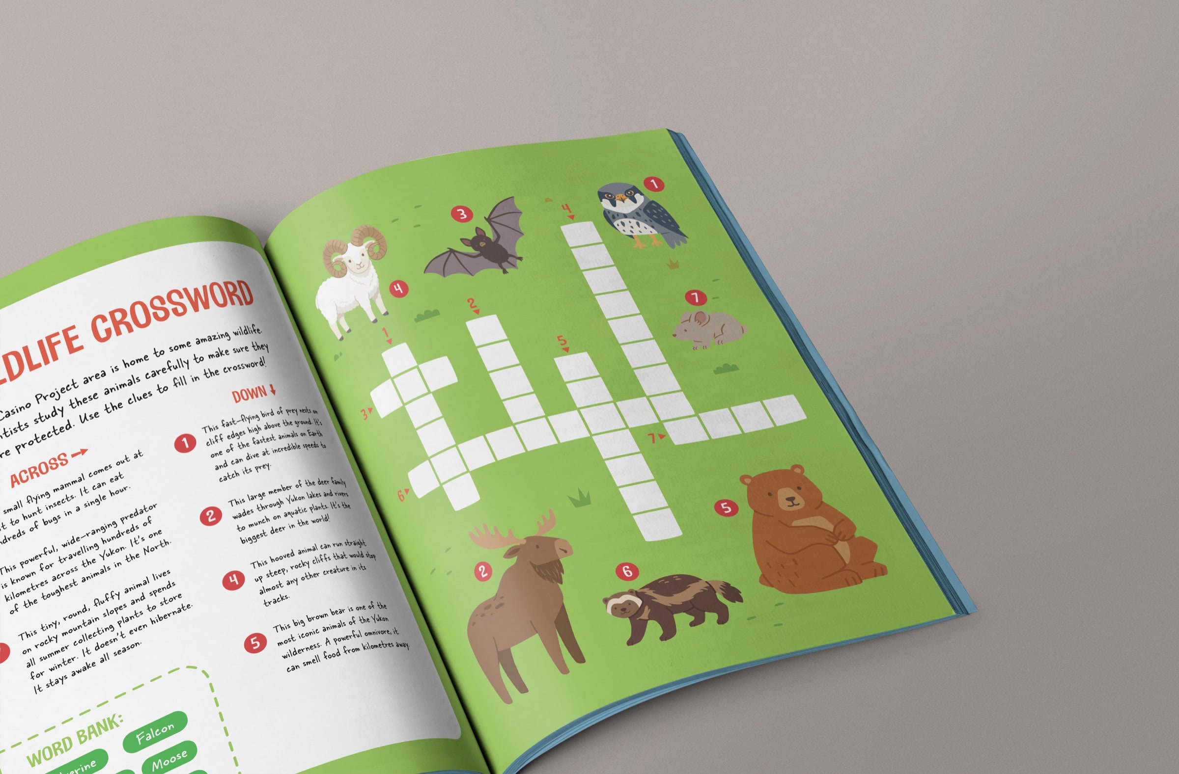
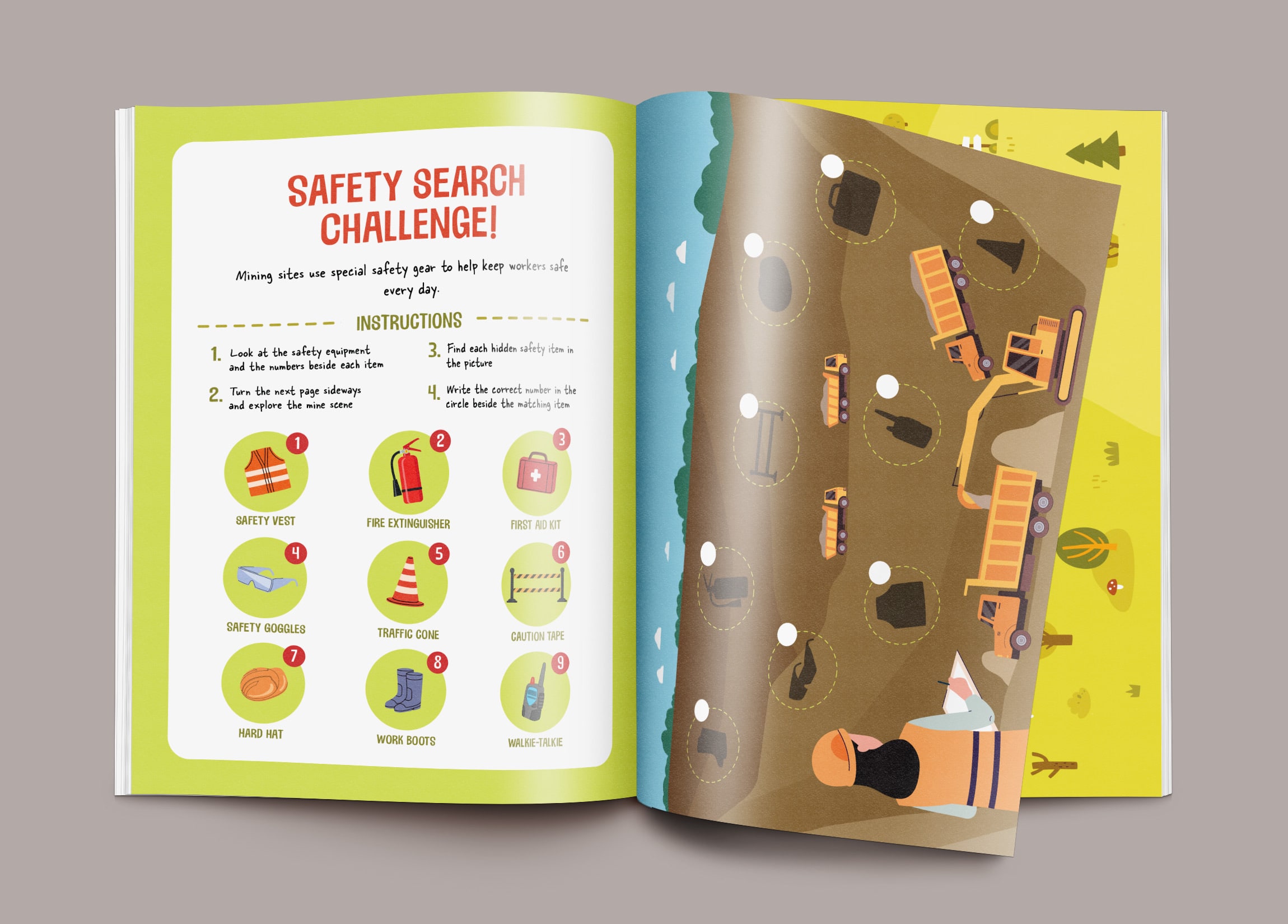
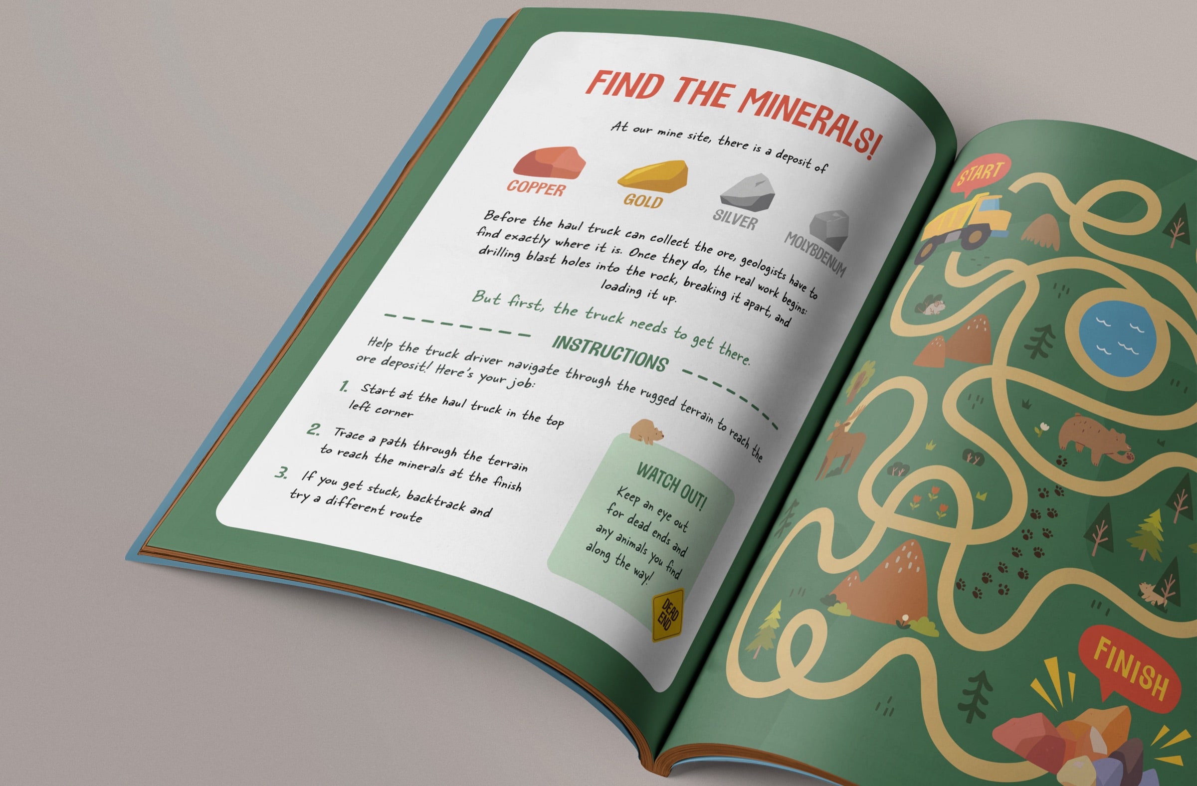
This project was a bit of a wildcard. It started with very little direction, which meant the concept, the specs, and every activity (copy, layout, and graphics) were mine to figure out.
The one thing I knew: this activity book had to explain the ins and outs of a mining project to an audience with zero obligation to care.
It was a balancing act, to say the least. It had to stay accurate, because kids repeat things. It had to respect the communities and First Nations the project sits alongside. It had to be fun enough to survive a car ride. And it could not feel like a PR move.
Bonus bonus!
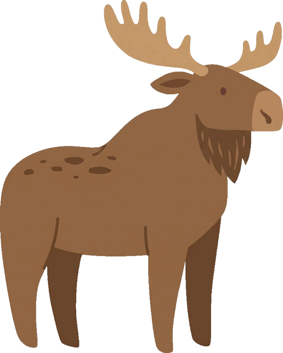
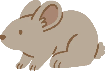
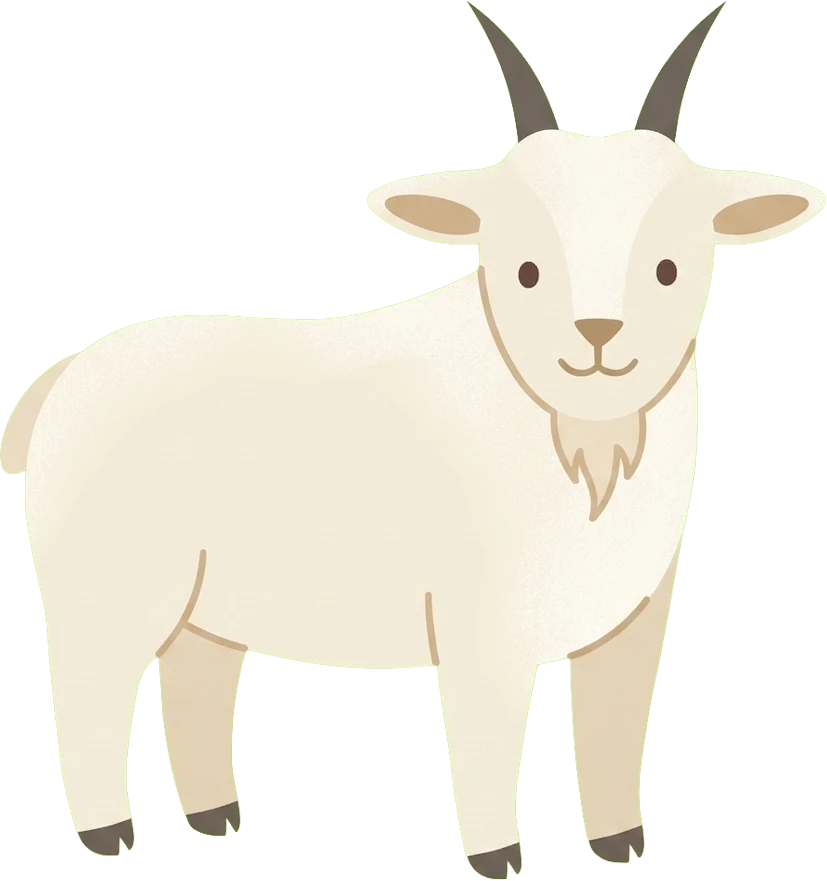
Meet the locals.
I drew the Yukon wildlife in the book. These ones wandered off the page.



Clear beats pretty.
Nobody picked these up for fun. So instead of trying to win anyone over, every page tried to leave fewer questions than it found. (Pretty still snuck in where it could.)