Making tech a littleless tech-y.
Brand identity,
Identity for Coach Cedar.
Created as Art Director while at BOLD LIP.

The ask
Coach Cedar is an AI fitness coach. It just can’t look like one.
Coach Cedar is a fitness app that remembers your history, adapts when life gets in the way, and checks in before you disappear.
Even though it is explicitly an AI-powered product, the brand needed to make all that feel human, not tech-y.
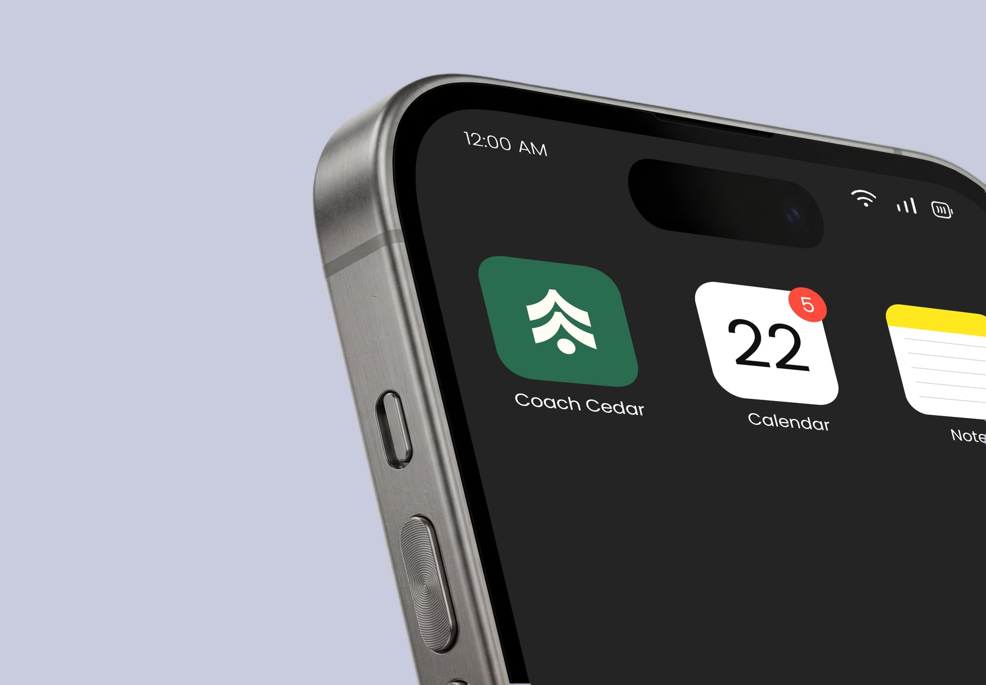
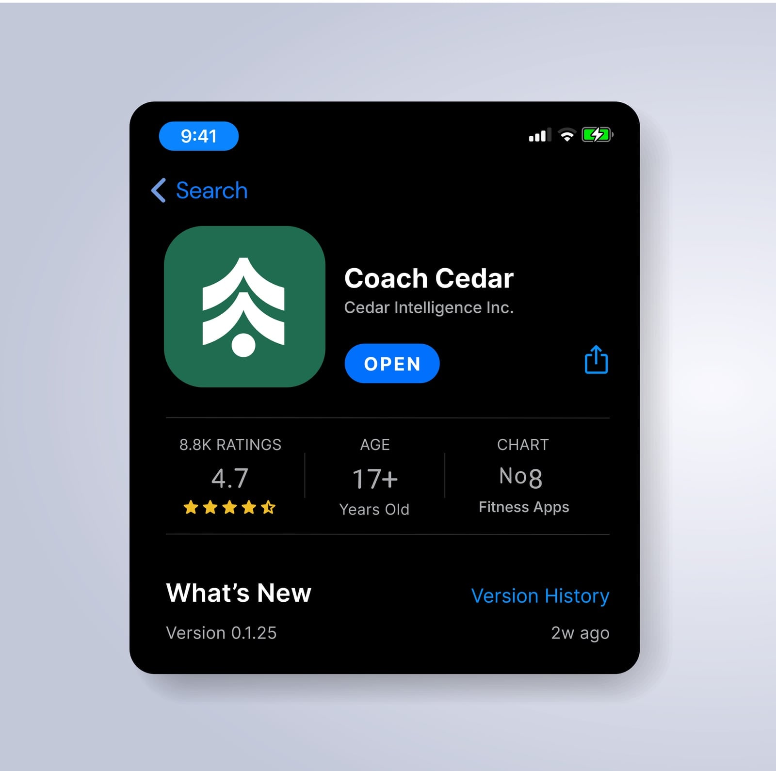
Somewhat warm, but not soft (think good-but-firm coach, not a wellness retreat). The logo had to be clean and simple, and still hold up at app-icon size.
Initial Concepts

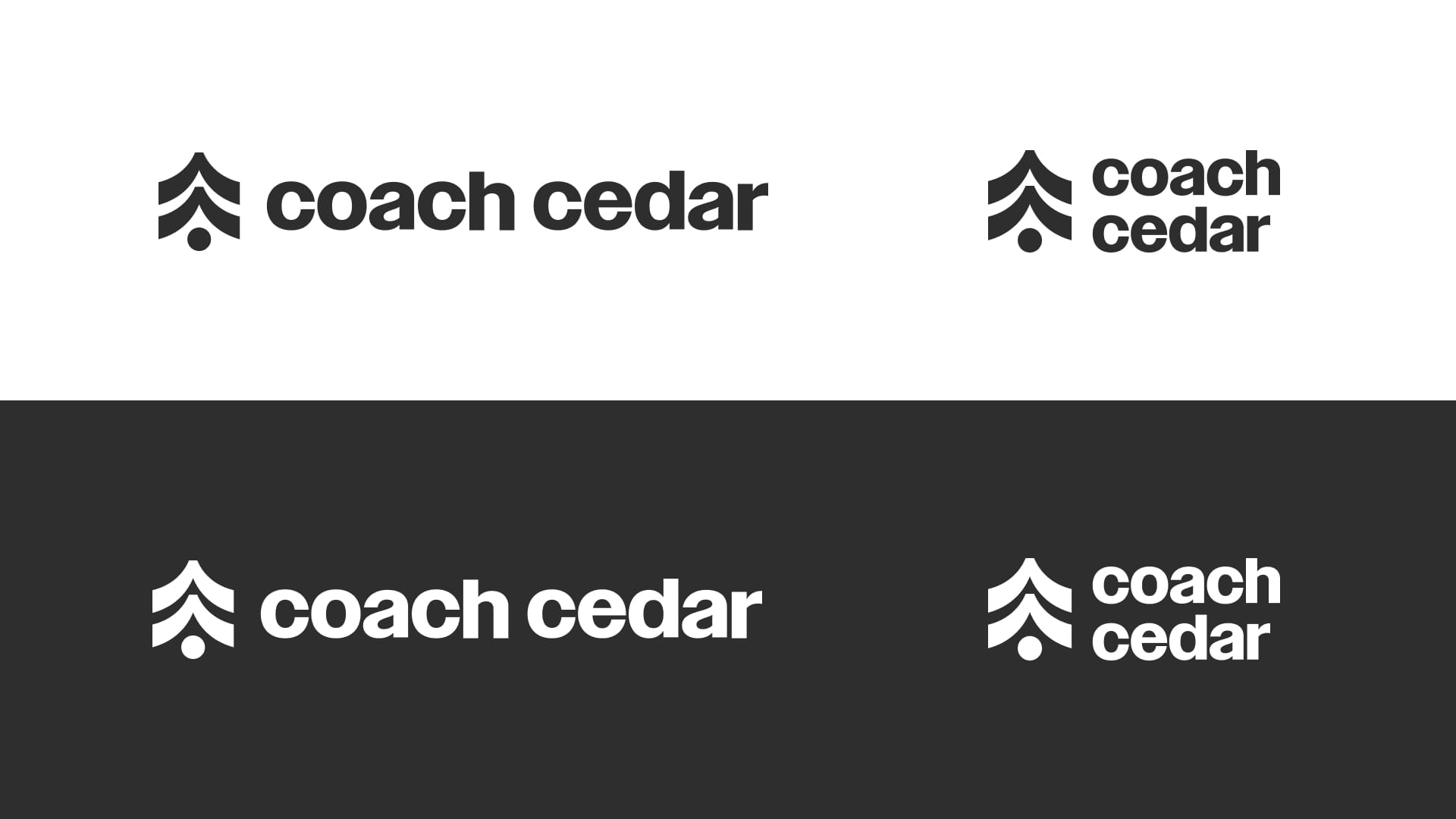
The Tree
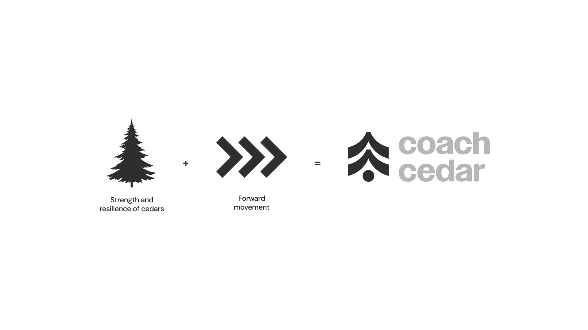
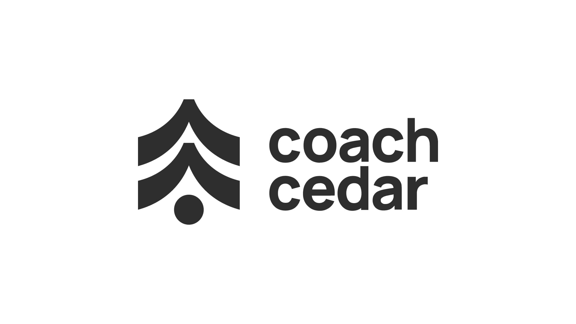
The mark is two ideas stacked. A cedar for strength (the thing still standing after winter), and forward chevrons for momentum. Layer them and you get a tree that’s also an arrow, which is the brand in one shape: something you can lean on that’s also going somewhere.
I started with the type: a heavy-ish sans that’s friendly without going soft. Then I drew the mark to match it, same weight and same curves, so the two look like they came from the same universe.
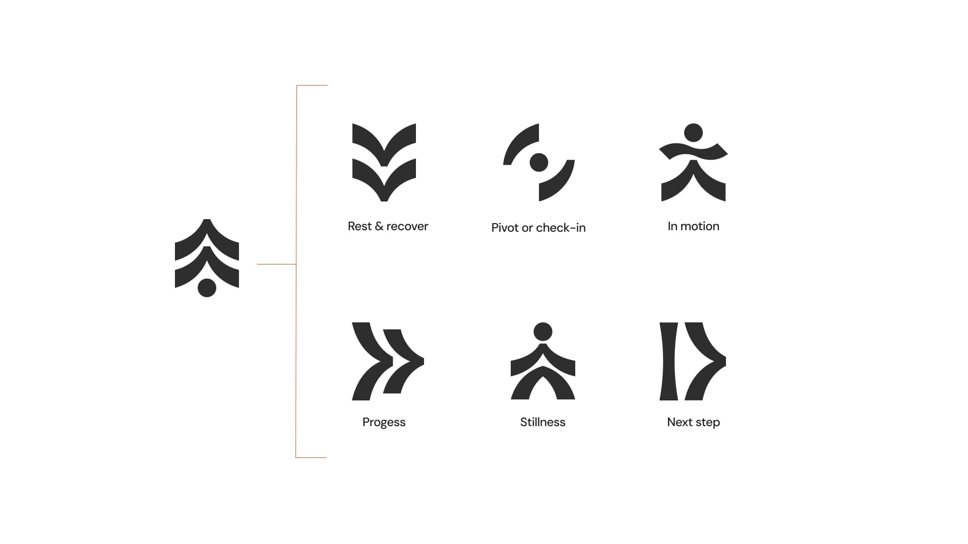
Supporting iconography! Every mark is drawn from the same curved stroke as the logo. Rotated, stacked, or mirrored; the system stays coherent.
The idea is that this icon system symbolizes every state: resting, pivoting, moving, progressing, still, stepping forward, etc.
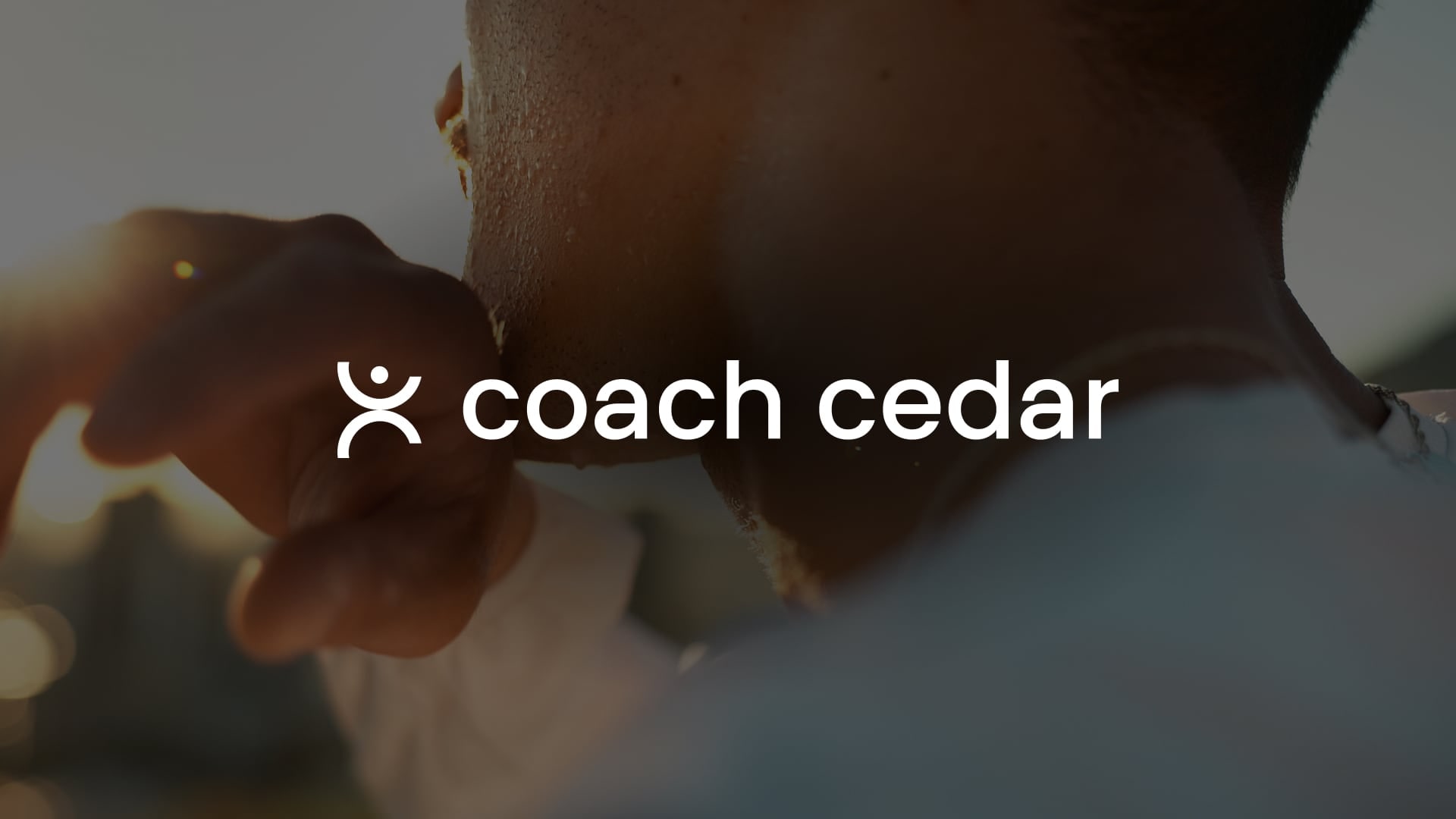
The Human™
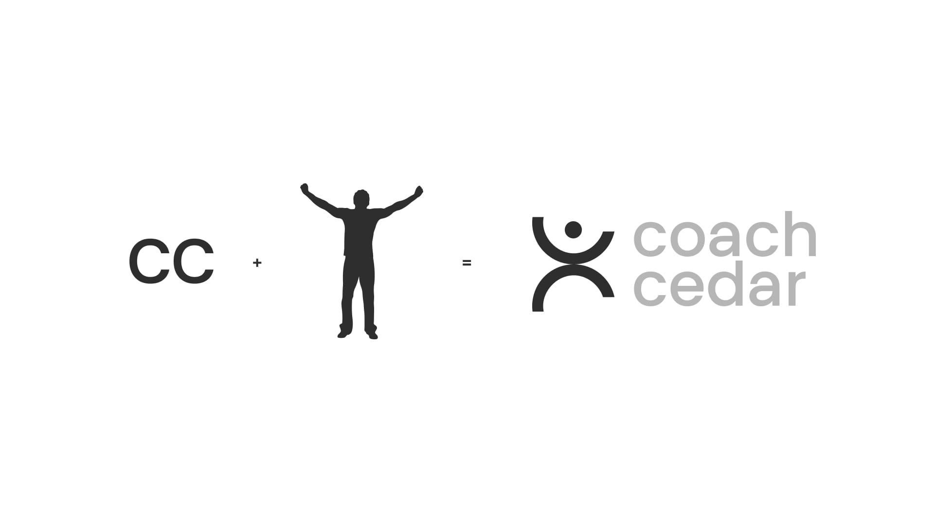
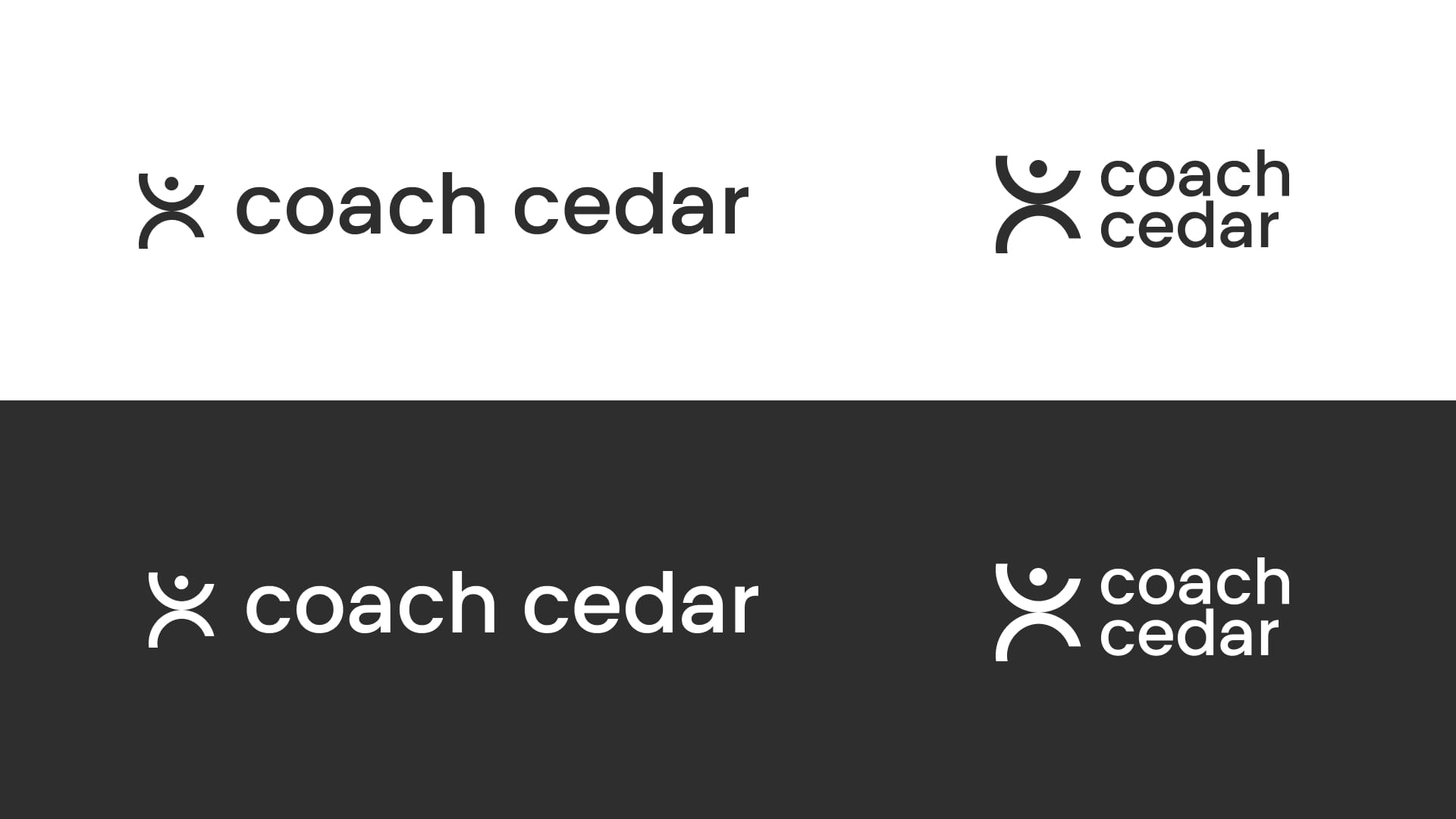
The brief said the CC monogram had legs, so I went back to it. Two Cs, one circular stroke. Since the whole point is “a person, not a product,” I asked what happens if the C becomes the person. Head, arms up, but not “just won a marathon” up. Somewhere between a stretch and a wave, if you squint.
The wordmark is lighter here. If it were an actual person, it’d be the nicer coach when compared to concept 1.
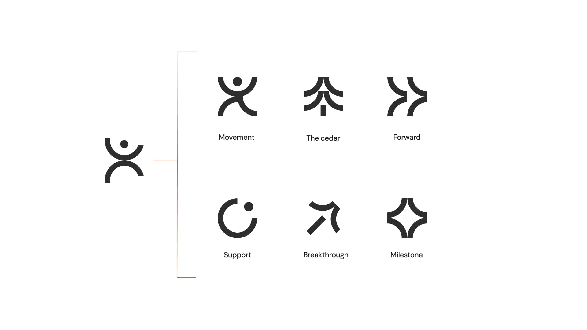
You guessed it! Supporting iconography again. The icons track the relationship rather than the workout: showing up, support, a milestone. There’s also a cedar tucked into the set, because I wasn’t going to waste a good tree.
Logo development
The mark stayed.
The type got friendlier.
The wordmark I had originally proposed for this concept was more geometric, a bit stiff for the client’s preference. Which is a fair description of most fitness apps, and not what a coach who remembers your bad knee should sound like. The final is rounder and lighter, with softer curves and more room to breathe.


Fonts & colours
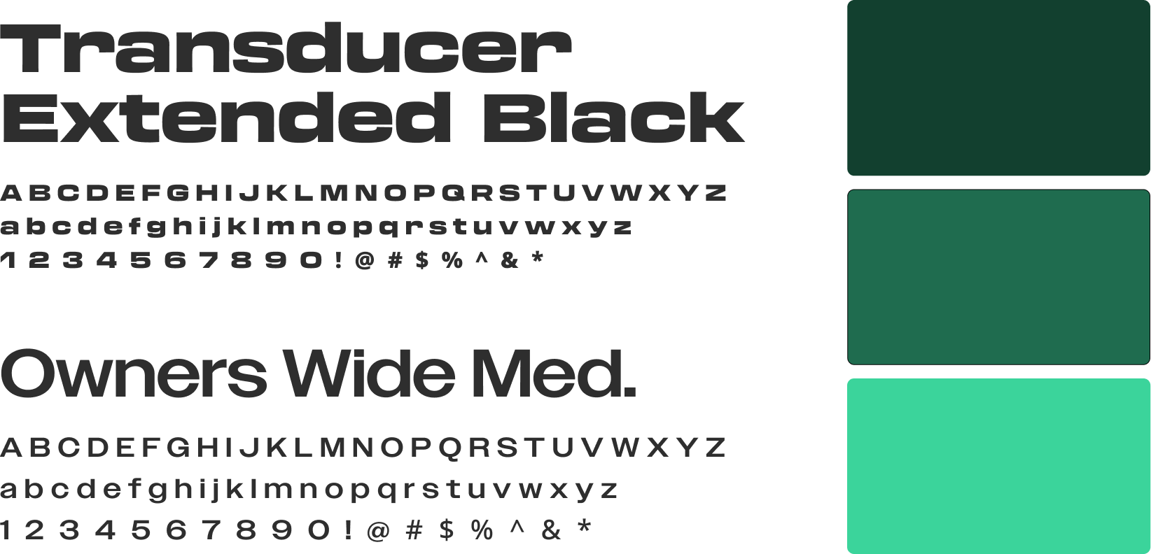
Originally, I’d also proposed new colours. They did not survive V2. Cedar’s green was already established in the UI, and when that colour is doing that job, replacing it is a big ask. So instead of swapping the green out, I made it work harder: three stops of the main green instead of one.
As for the brand’s fonts, the wordmark and UI had to stay in their own lane. For display, though, we landed on a different pairing: Transducer Extended Black and Owners Wide Medium. The goal was a font combo that would share a similar width but with enough difference in weight.
Visual system
The mark as architecture.
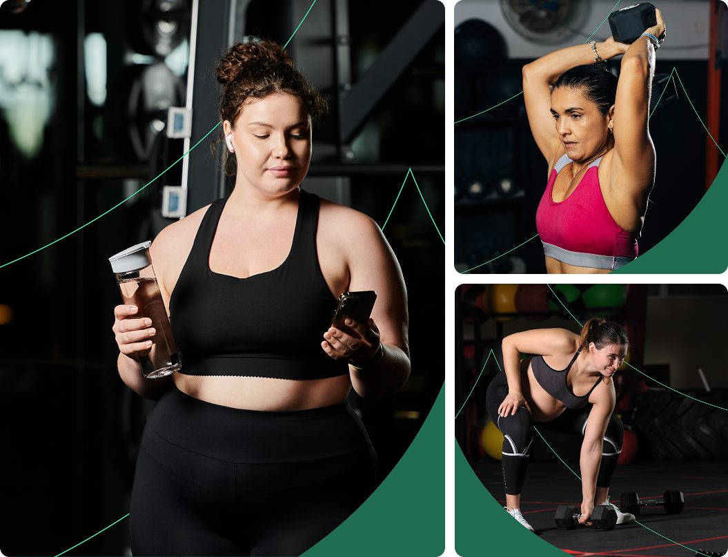
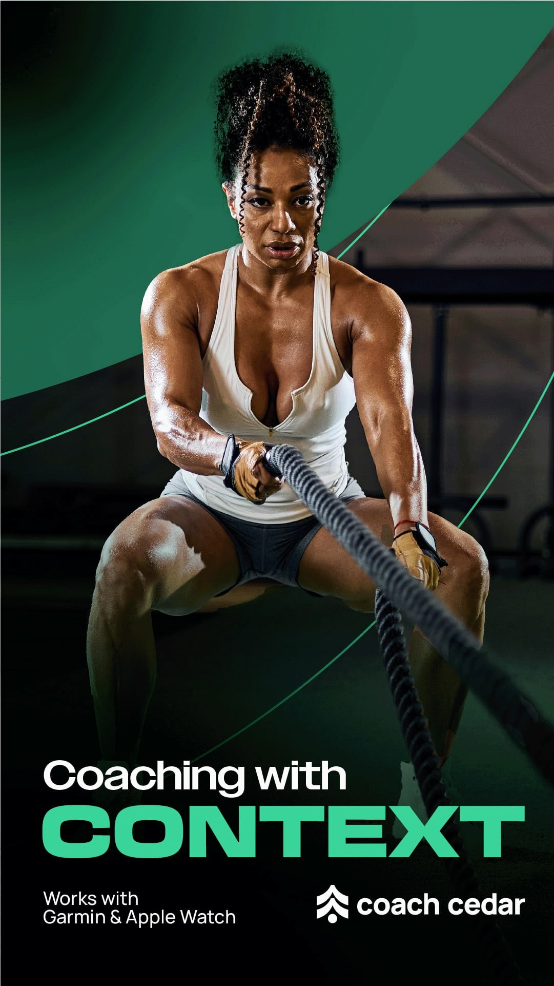
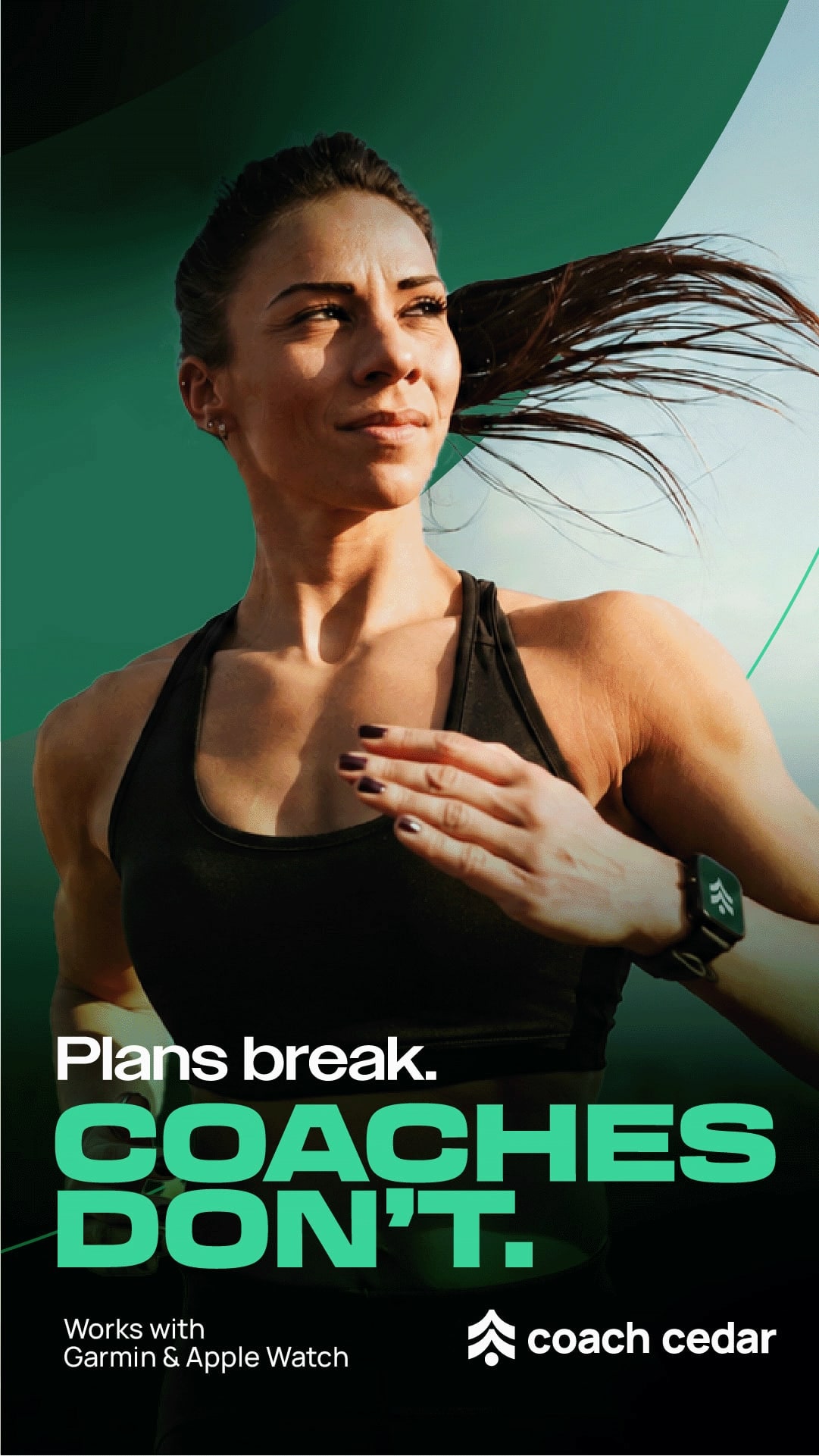
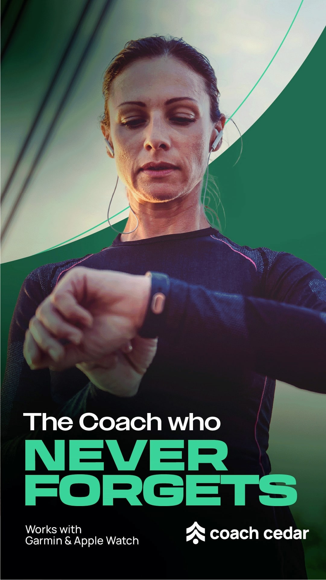
The visual system is built from a single source: the cedar mark.
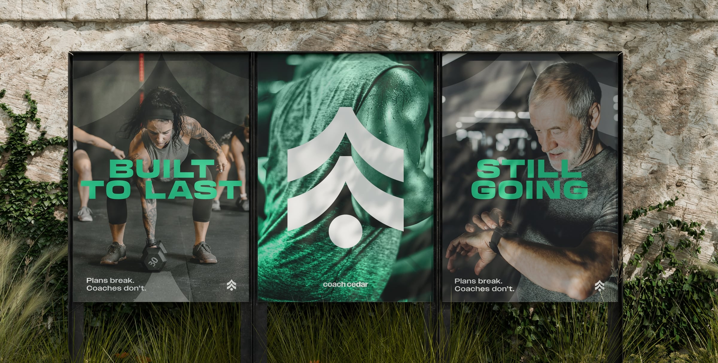
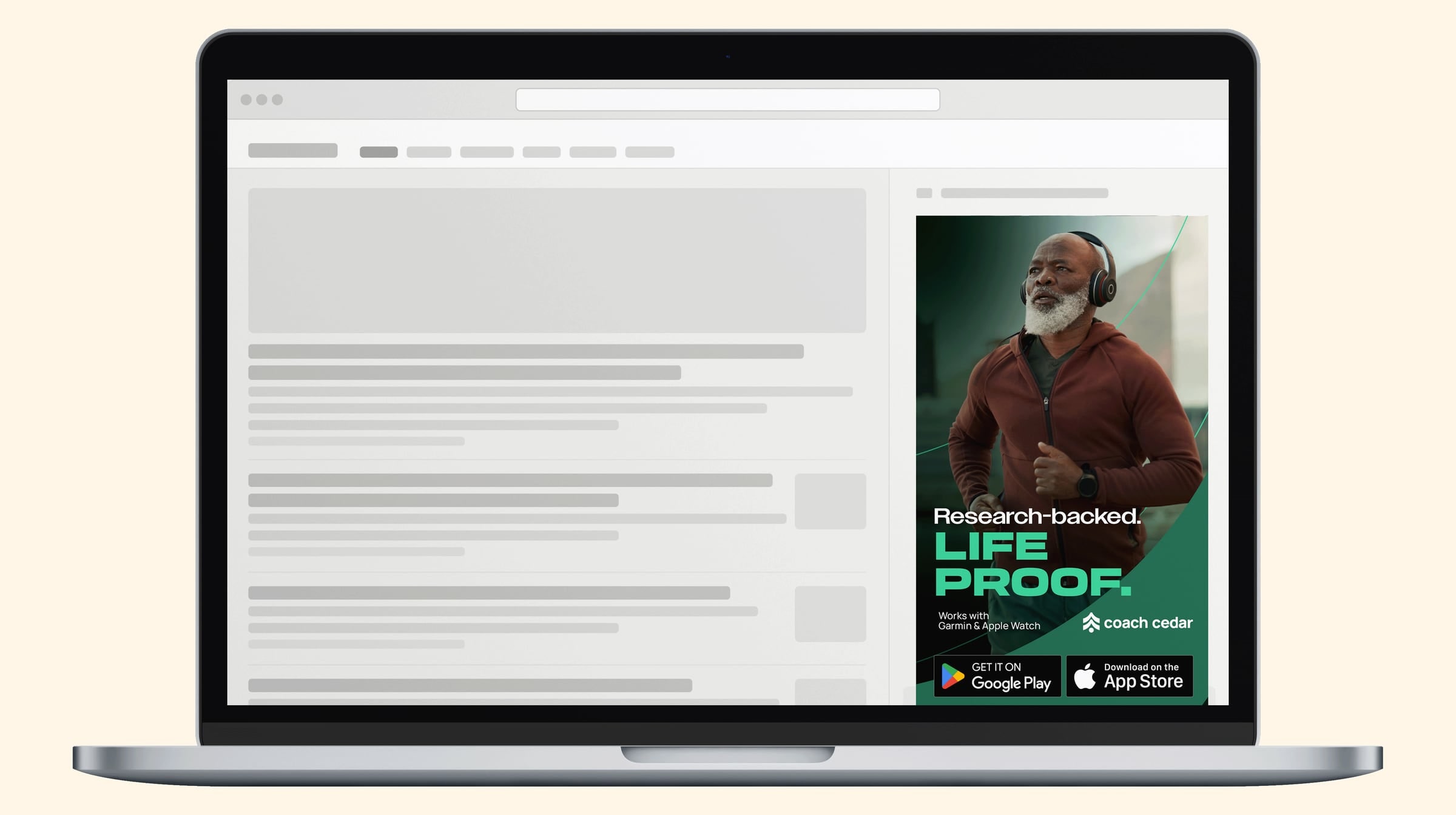
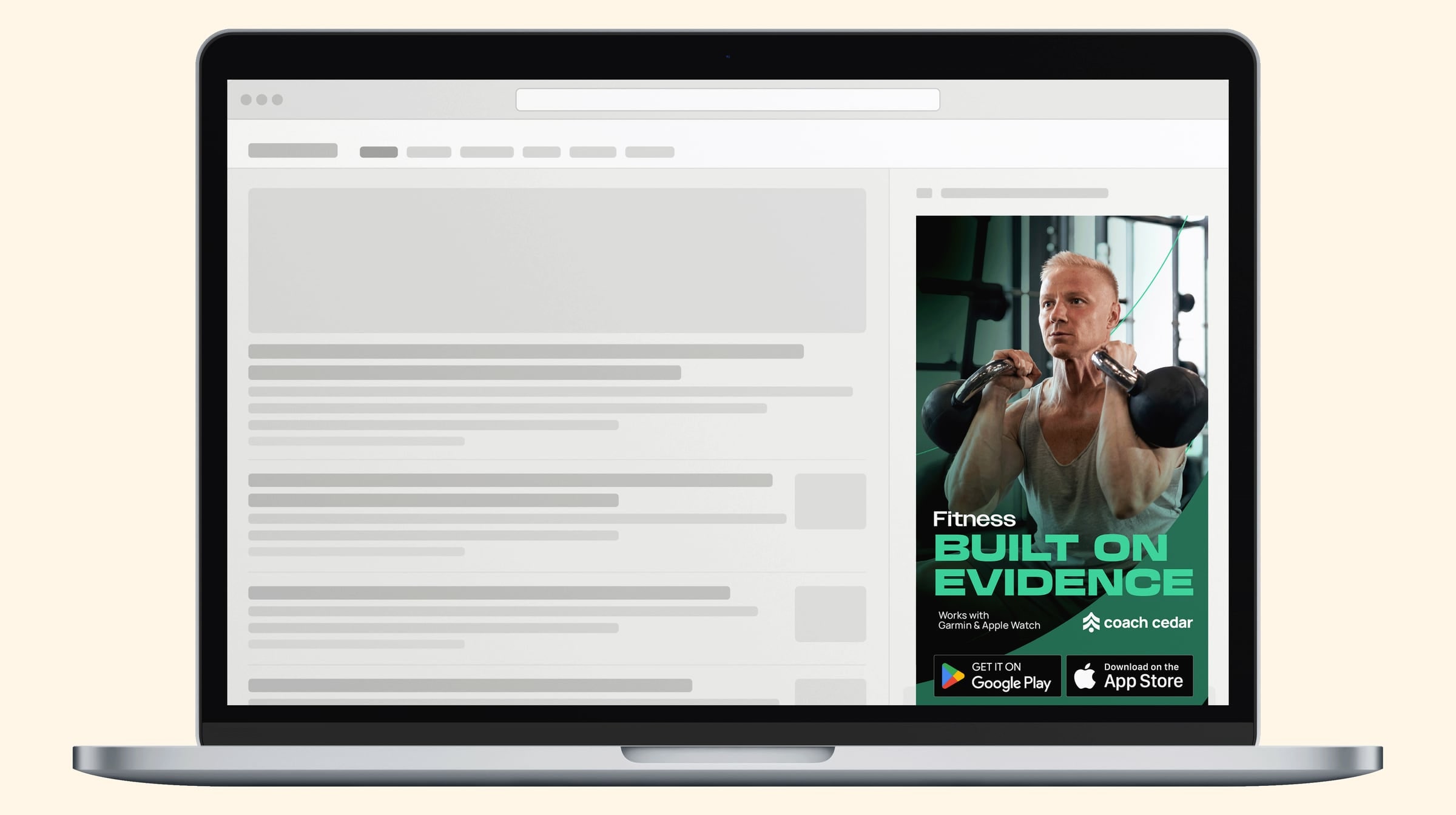
The thin, curved strokes are the mark’s outlines. Scaled up to its curve and placed behind the subject, it uses just the contour to frame and add movement.
The solid, full-colour mark is scaled too and sits over the image, adding dimension without overpowering the image.
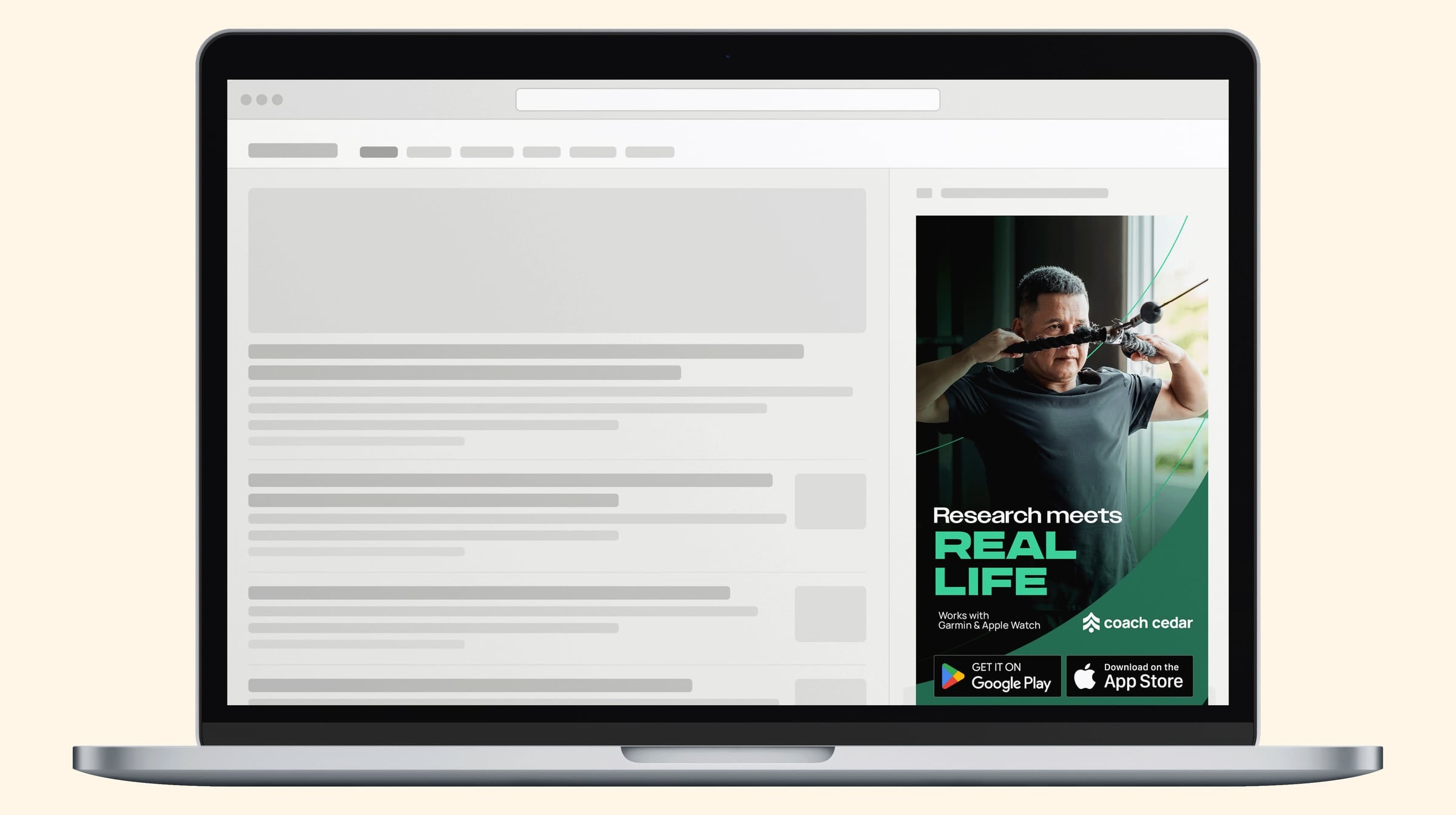
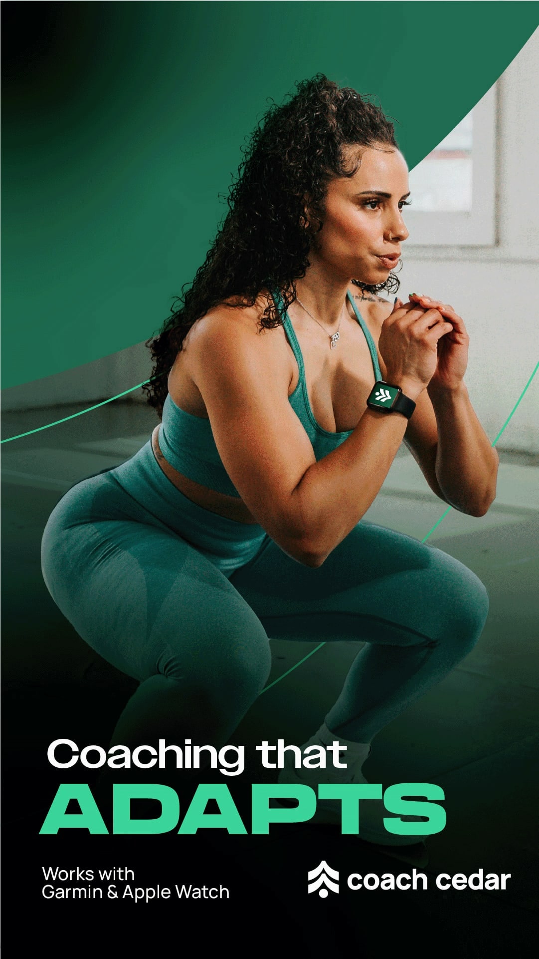
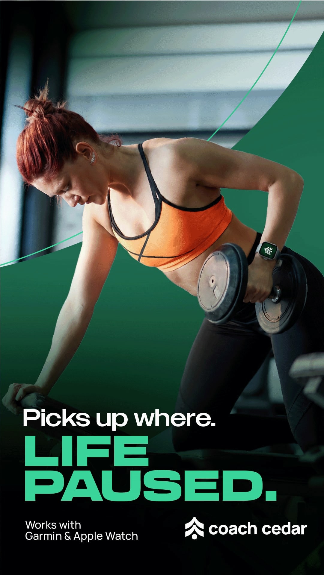
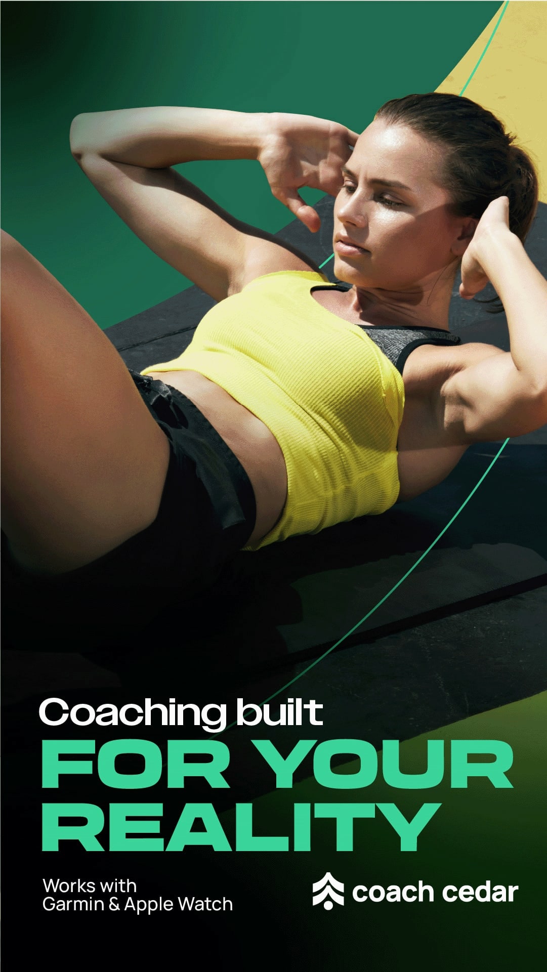
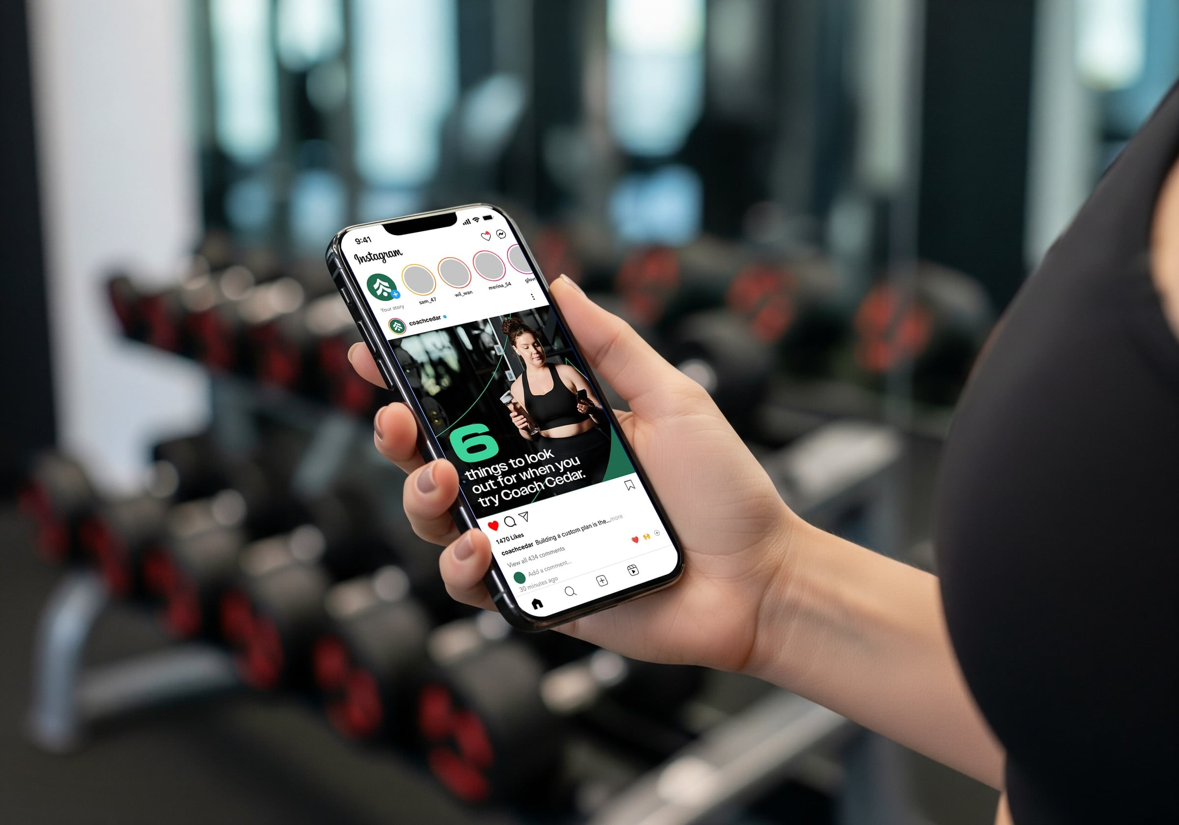
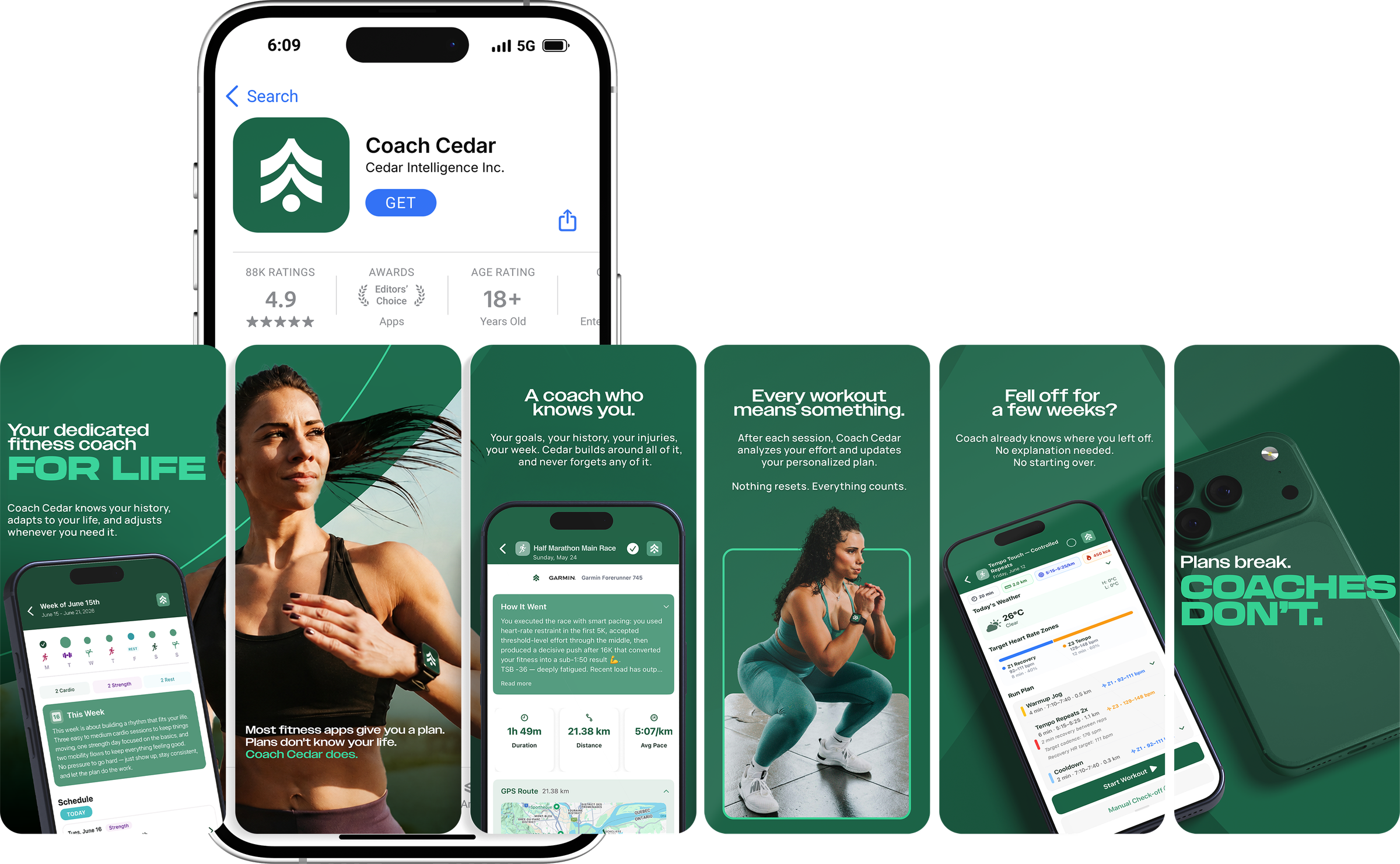
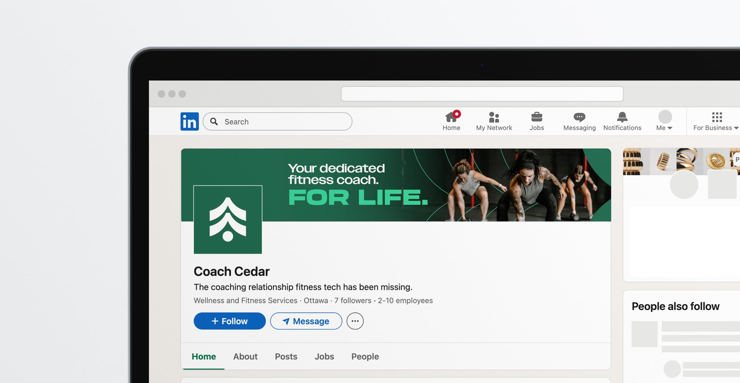
Less tech-y. More coach-y.
It’s still an AI fitness app. It just shows up looking like the coach who remembers your bad knee.