Advocating for girlsto take up space.
Concept development,
Campaign for Elmwood School
Created as Art Director while at BOLD LIP.
The ask
Elmwood is making room for the next generation of leaders.
And I mean “room” in the most literal sense. Elmwood was preparing to launch a $10M capital campaign to support a $20M campus expansion.
But this campaign was not meant to be about brick-and-mortar.
Instead of selling buildings, we had to sell what the buildings make possible: the next generation of female leaders.
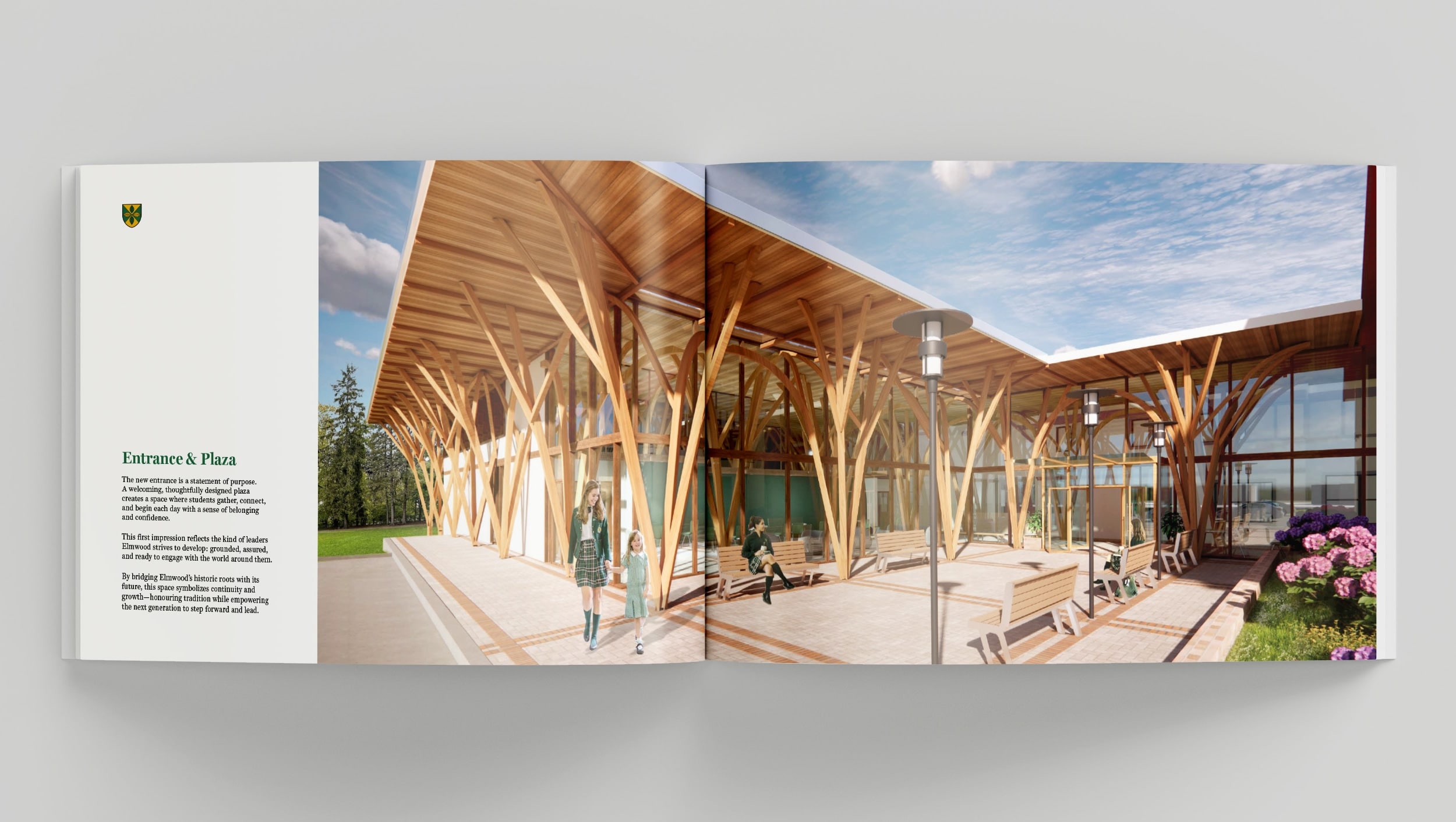
Performance halls, fitness facilities, and shared spaces are not nice-to-have amenities, they are leadership infrastructure. These are the spaces where girls figure out who they are, what they like, and what they’re capable of.
The insight
Women have always been told to take up less space.
Sit smaller. Speak softer. Take up less.
Elmwood has spent over a century fighting for the opposite.
One thing’s for sure: Elmwood produces leaders. Their girls don’t shrink. They expand, they lead, they take up exactly as much space as they need.
So when it came time to campaign for new physical spaces? The metaphor was already there. We just had to not waste it.
Initial Concepts
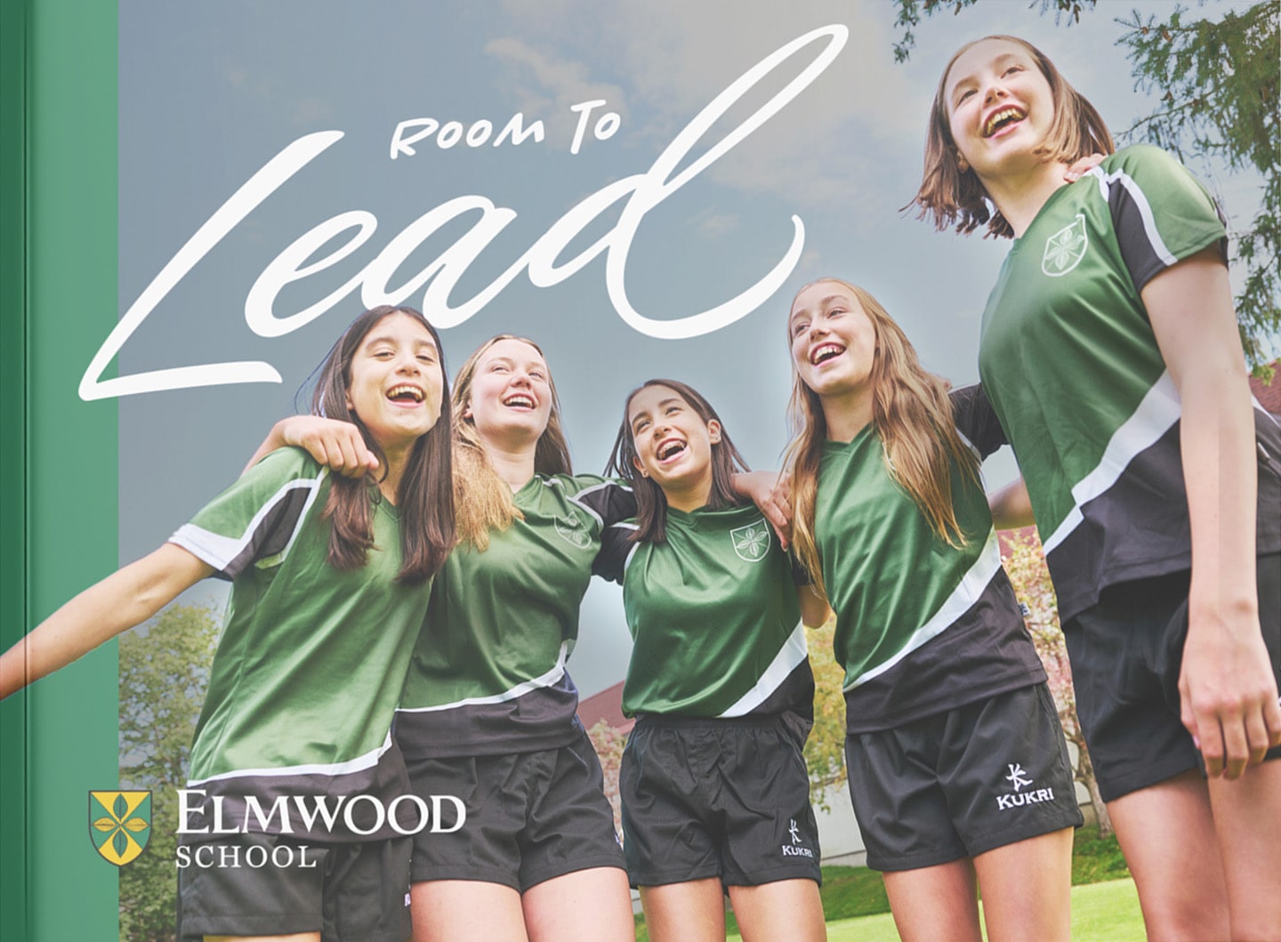
Room to Lead
The double meaning was the whole pitch. “Room” as in the literal spaces being built. And “room” as in the permission, capacity, and freedom to lead without someone moving out of your way first. The risk was that it leaned more spatial than female-forward, which is why it eventually got Frankensteined into something that could carry both.
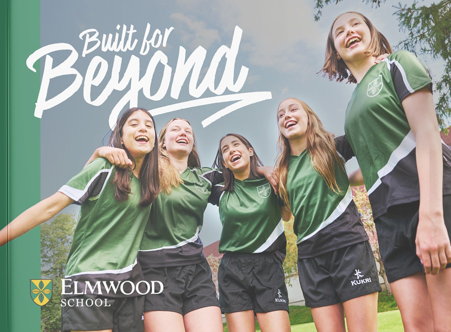
Built for Beyond
This one came from sitting with a line in the brief: the girls are already extraordinary, now their environment must match them. The campus wasn’t ahead of the girls. The girls were ahead of the campus. So the build was overdue. Built for Beyond tried to say that. The type treatment I developed for it ended up doing a lot of the heavy lifting: “Beyond” breaking out of the frame, the underline that keeps going past the word. The concept that the name exceeds its own container felt right for girls who do the same thing.
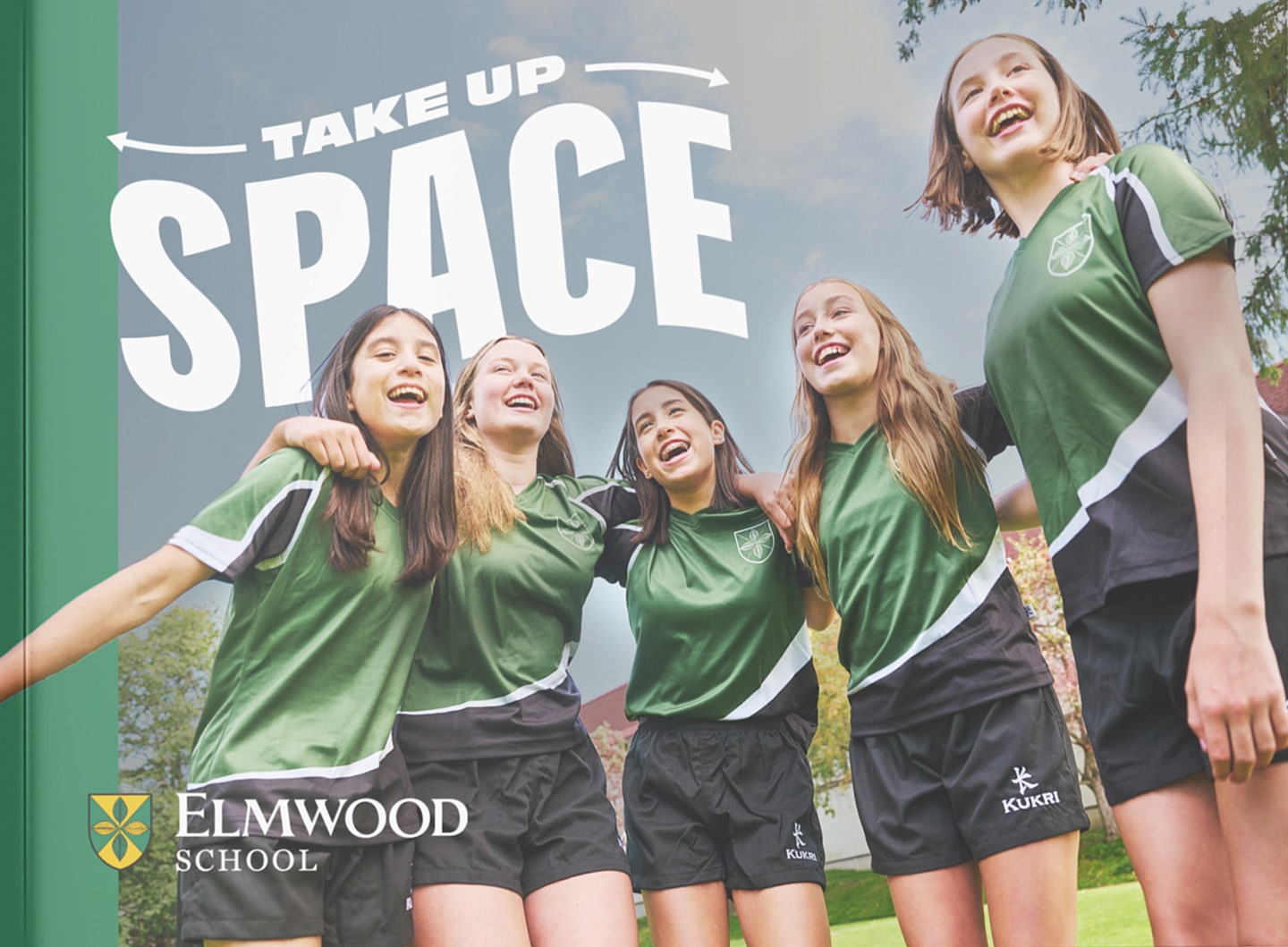
Take up Space
My favourite of the three to develop. There’s something that happens when you tell girls to take up space. It lands differently than any other instruction. It’s specific, it’s culturally loaded in the best way, and Elmwood could actually back it up with a century of proof. The challenge was keeping it from tipping into slogan territory. It had to feel like a truth the school had always held, not a trend it was borrowing.
The answer
Space. The literal kind, and the kind women have always had to fight for.
What if the campaign’s language did two things at once?
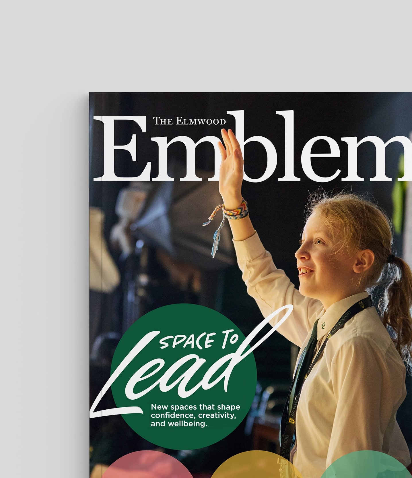
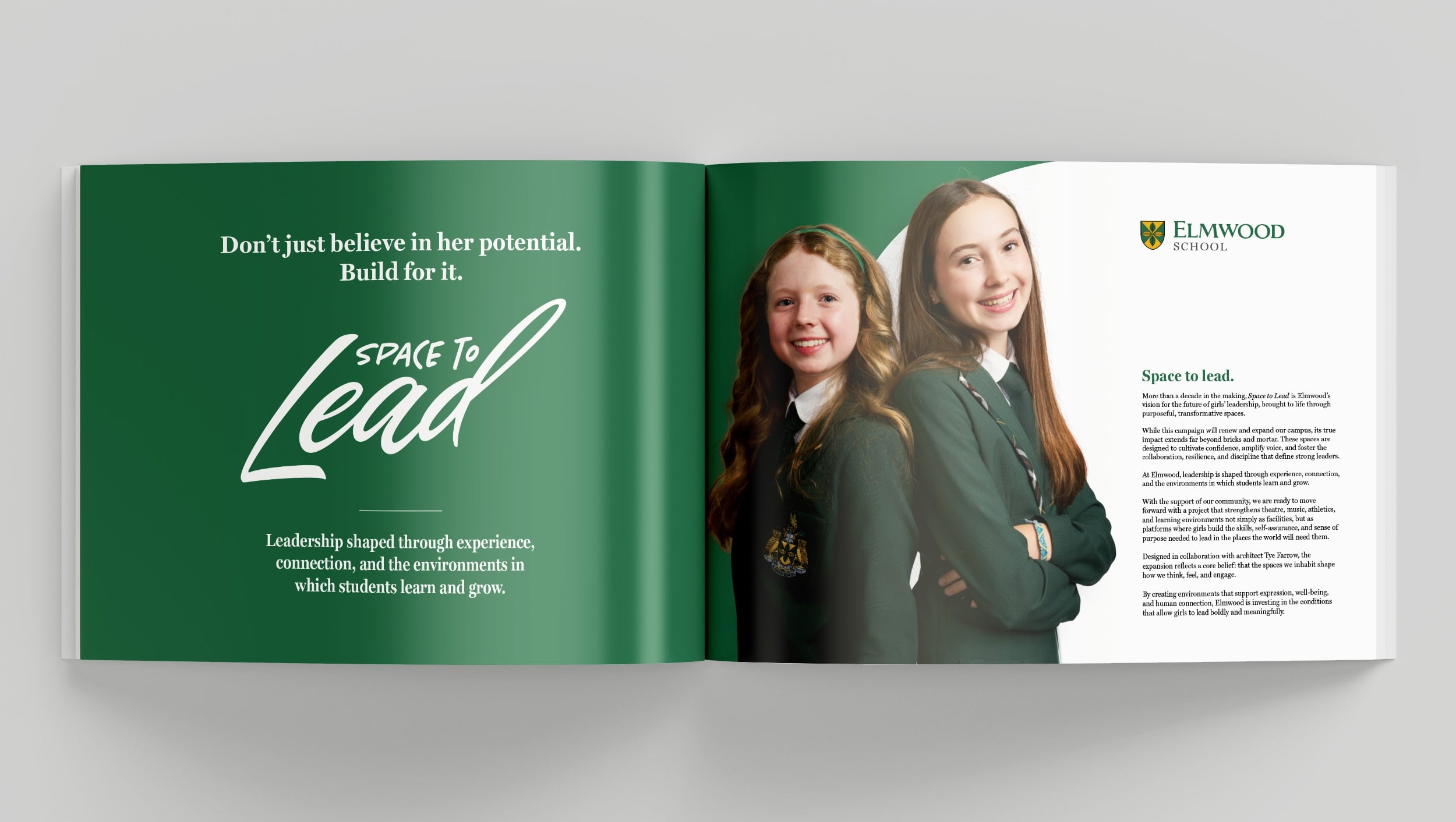
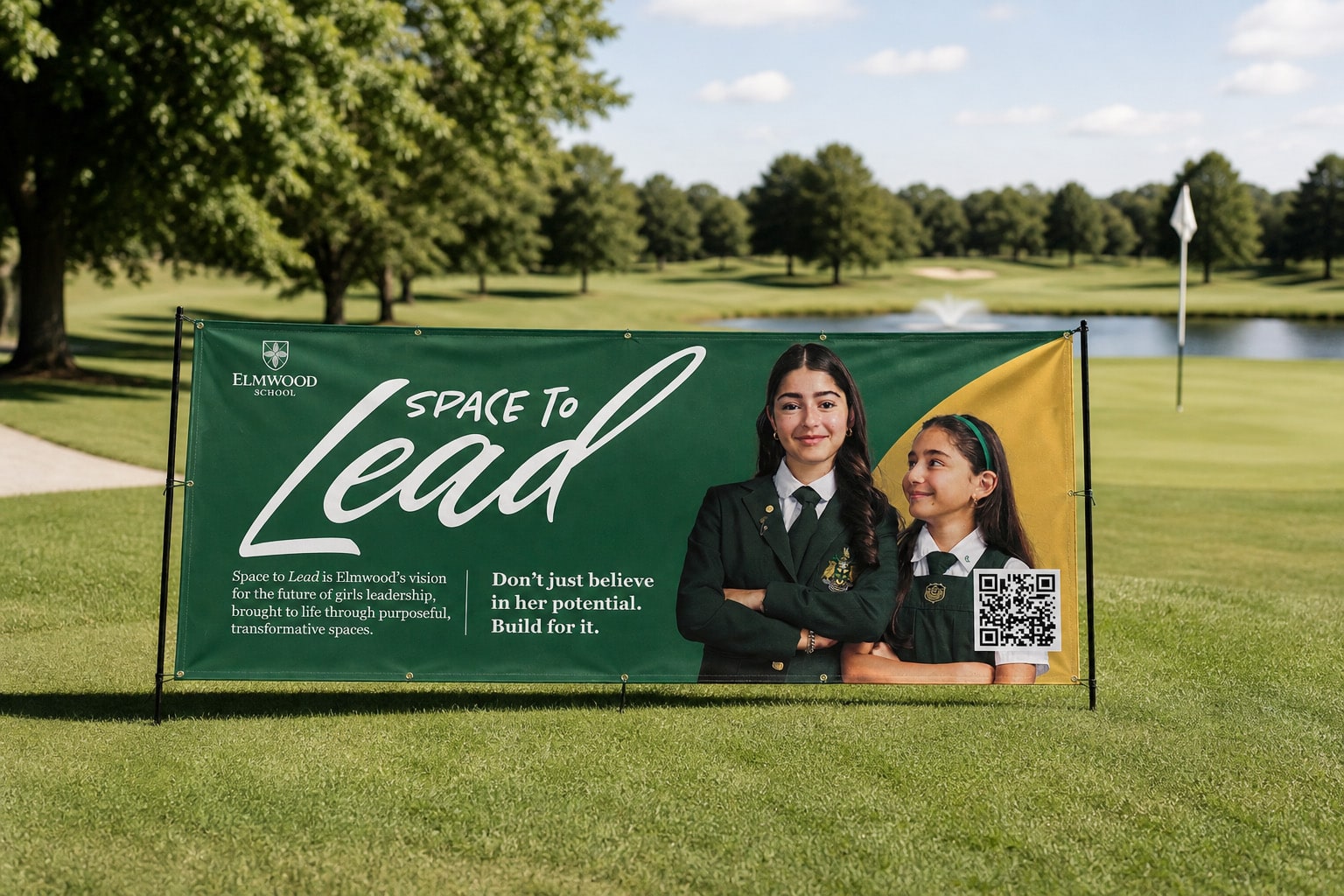
Space to Lead. Literally: new spaces being built for girls to lead from. And less literally: the kind of space women have been claiming for themselves for decades. One name carrying both.
The whole campaign language follows the same logic: she’s not being handed anything. She’s already leading. The space just has to catch up.
Now, I’m no copywriter, but I had lots of fun coming up with taglines and supporting lines! If you’re a copywriter, though, look away (please).
The lockup
A logo that takes up space.
If the name is about space, the logo had better use some. Here’s what it’s doing, one layer at a time.
Space is the small word.
SPACE TO is tucked in up top in tiny caps. Lead gets the rest of the room. Which is the whole campaign, just in type.
Lead doesn’t fit.
Draw a neat box around the word and the d walks straight out of it. The name is bigger than its container. That part was on purpose.
It started as a font.
Then I got into the points and pushed them around until it stopped looking off the shelf. All 196 of them, for the curious.
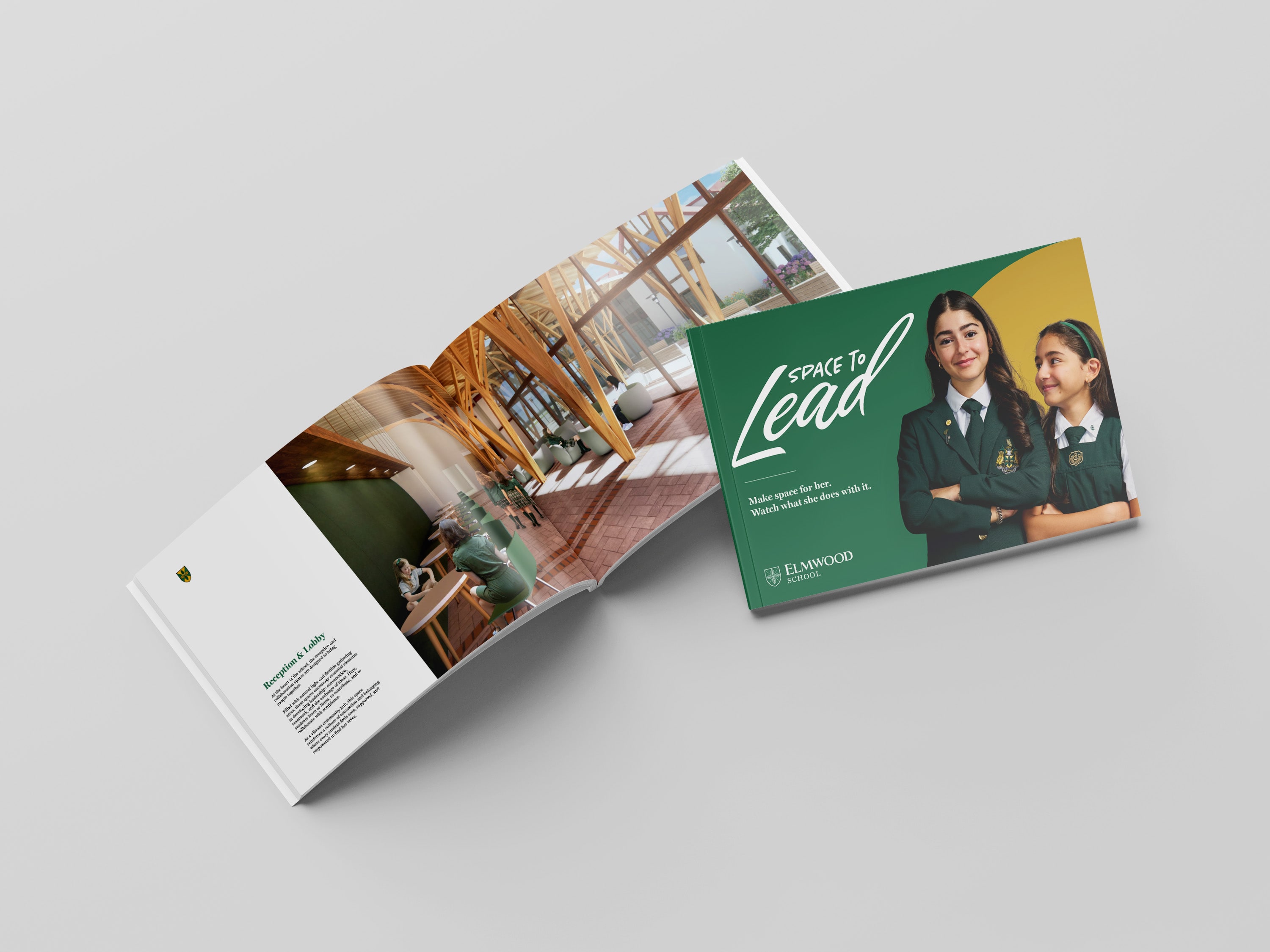
Roll the film.
The whole campaign in a couple of minutes. Sound on, if you can.
Big new spaces. Even bigger plans for the girls in them.
So, yes, it’s a fundraising campaign about buildings. It just doesn’t sound like one.